WEN-CHING CHANG
GRAPHIC DESIGNER | ILLUSTRATOR | CONTENT CREATOR
![]()
![]()
I am a graphic designer that enjoys using illustration throughout my work. I enjoy clean, minimalistic work with pops of colour now and then. I am a friendly person and copes with stress very well. My creative side of me all started when my grandmother gave me an old lipstick and paper and told me to draw whatever I wanted to.
Ever since then, I was hooked on coming up with different ways of drawing, which then led me to playing around on photoshop throughout my school career.
About me
Packaging Sole
Brief: The students were tasked to co-design with a user to create promotional packaging for the pharmaceutical industry.
Concept: I decided to create a care pack, in the form of a moonbag, that will help someone who has anxiety while going out. The moonbag has sections inside that will hold the medication and other ‘care’ items. Giving the moonbag a second life for when the items are finished.
 Anxiety-Care Pack
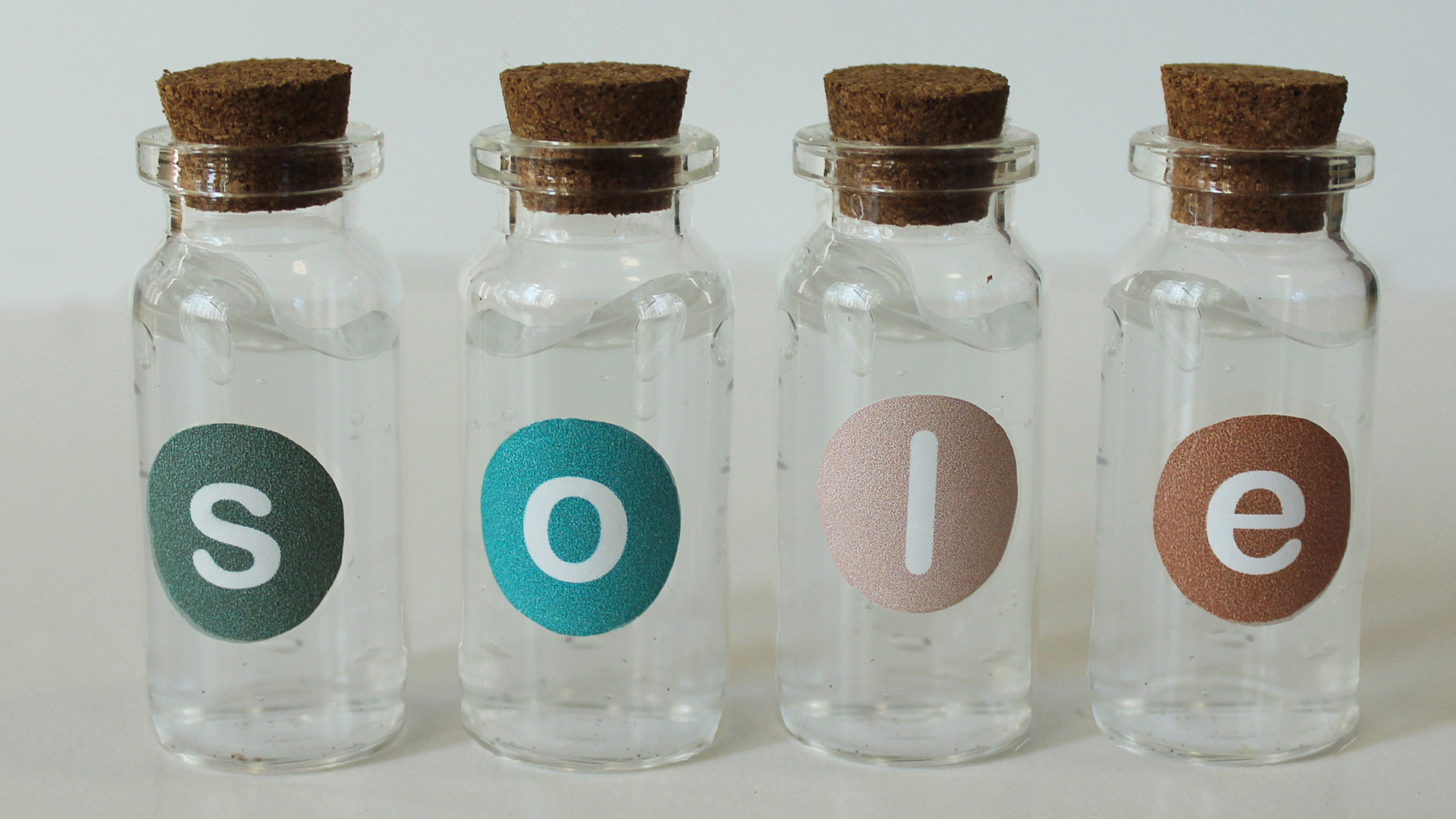 Anxiety-Care Pack
 Anxiety-Care Pack
 Anxiety-Care Pack
Bare Your Endo
Brief: Create a typeface that links to a genre, song or musical movement that represents a cause of our choice. There were four elements to our typography: a 12” x 12” vinyl cover, a poster, GIF’s and an online instagram concert.
Concept: The cause chosen was endometriosis. Since there is a lack of awareness, due to it being ”invisible” and usually known as an ”old woman disease”, teenagers suffer unnecessary pain. Our typeface was inspired by a music genre called Bedroom pop. It’s intimate, imperfect, focuses on bringing what’s inside, out and is championed by the youth.
Creative collaborators: Imrah Benjamin, Angeline Dancig
 Bare Your Endo
 Bare Your Endo
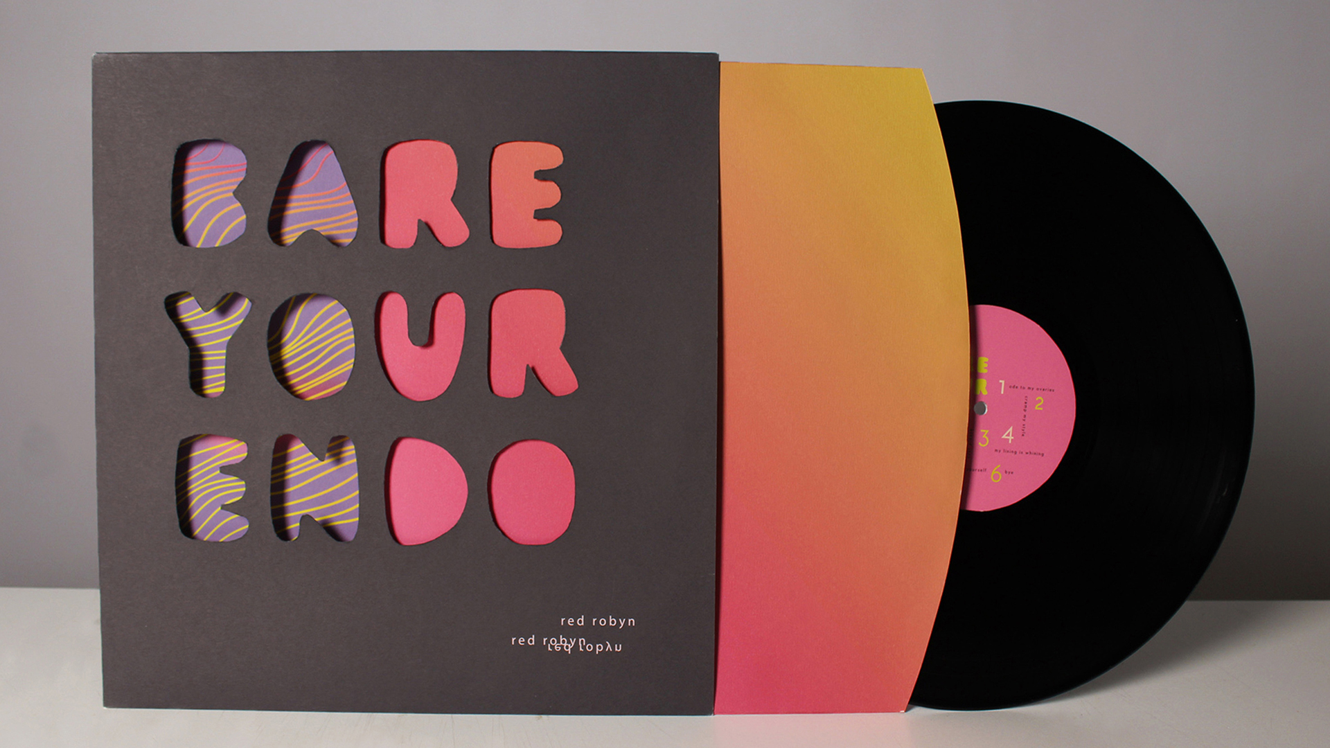 Bare Your Endo
 Bare Your Endo
Social Distancing Zine
Brief: The students were tasked to create their own unique typeface, to convey a UN message regarding COVID—19. To be displayed in any creative editorial piece and creating a second touch point.
Concept: The UN message I focused on was social distancing, naming my typeface ‘stretch’. Reason behind the ‘wonkiness’ of the typeface is to symbolise how unstable social distancing is in the townships. I created a zine that is made to fold out into one meter to help people measure the distance between them. The second touch point is a long sleeve t-shirt to help communicate how important social distancing is.
 Social Distancing Zine
 Social Distancing Zine
 Social Distancing Zine
 Social Distancing Zine
Amaize
Brief: The students were each given different clients and were tasked to create a festival/event to celebrate the culture that is present in that township.
Concept: The client that I was given was Crossroads. I wanted to ‘cross’ lives with different cultures, and wanted to bring in more local middle class South Africans to the township. What better way to bring people together than food, which led me to making a food market where Crossroads can make and sell their food to South Africans, exchanging knowledge of the Xhosa cuisine.
 Crossroads Food Market
 Crossroads Food Market
 Crossroads Food Market
Kalon
Brief: Create and come up with an interesting way that can convey to the older generation that tattoos on women are not masculine, but rather something that can show their femininity.
Concept: Since women view their tattoos as art, what a better way to communicate that to the older generation than a virtual art gallery. The name of the art gallery is Kalon, meaning beauty is more than skin-deep. The art gallery will showcase female tattoo artists’ work, every month being a different style.
 Tattoo Art Gallery
 Tattoo Art Gallery