TATUM-LEE TITUS
GRAPHIC DESIGNER | DIGITAL DESIGNER
![]()
I am Tatum-Lee Titus and I’m currently doing the 1-year in graphic design course in a higher certificate in graphic design. I specialize in illustrations, videos, job cards, posts, and many more. I design various things for different clients depends on what they want and how they want it done. One of my strengths is that I easily adapt to an environment and learning new things. My skills are illustrator, photoshop, adobe XD and InDesign. What was most memorable for me at Red & Yellow was the way they run things, the way they ran classes, even though the face to face classes didn’t last long due to covid-19. The way Red & Yellow showed their interest in their students and put their student’s needs first. My hopes and dreams for the future are to be able to make a success out of my career and to show off my skills and master it to my full ability, to not have wasted my time of studying for this career of being a graphic designer.
Website https://taytimtitus06.wixsite.com/portfolio
About me
Web Design
We had to design a website that would help people during the lockdown. I decided to do a website about art because my artwork is what kept me mostly distracted from the lockdown. The art website is to show people what I have done and for them to share what they have done themselves with other people as well. My static background on the website represents, Your thoughts could suffocate you if you allow it to.
 Set of digital devices screen mockup
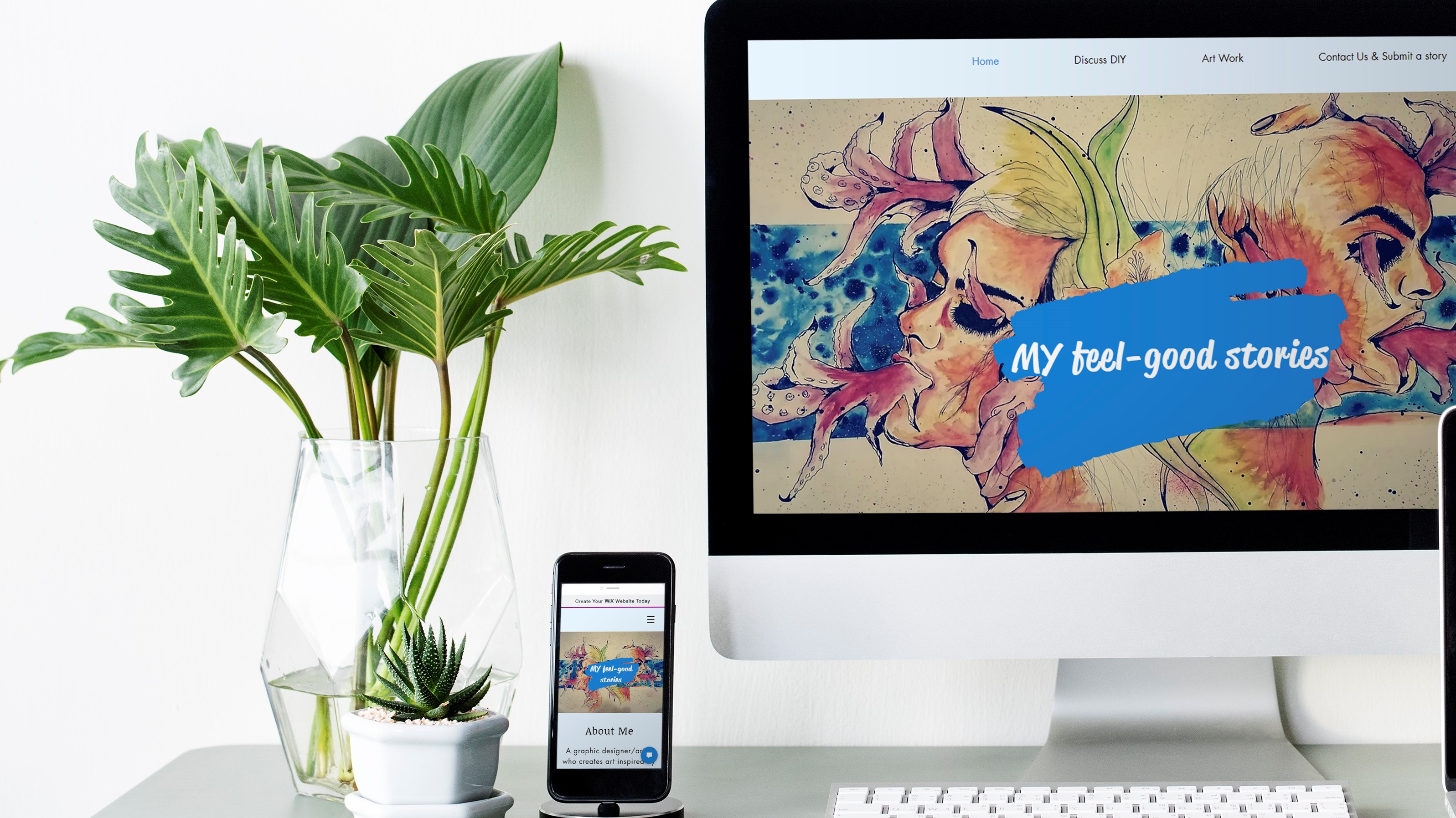 Set of digital devices screen mockup
 Set of digital devices screen mockup
 Set of digital devices screen mockup
 Set of digital devices screen mockup
Mobile App Design
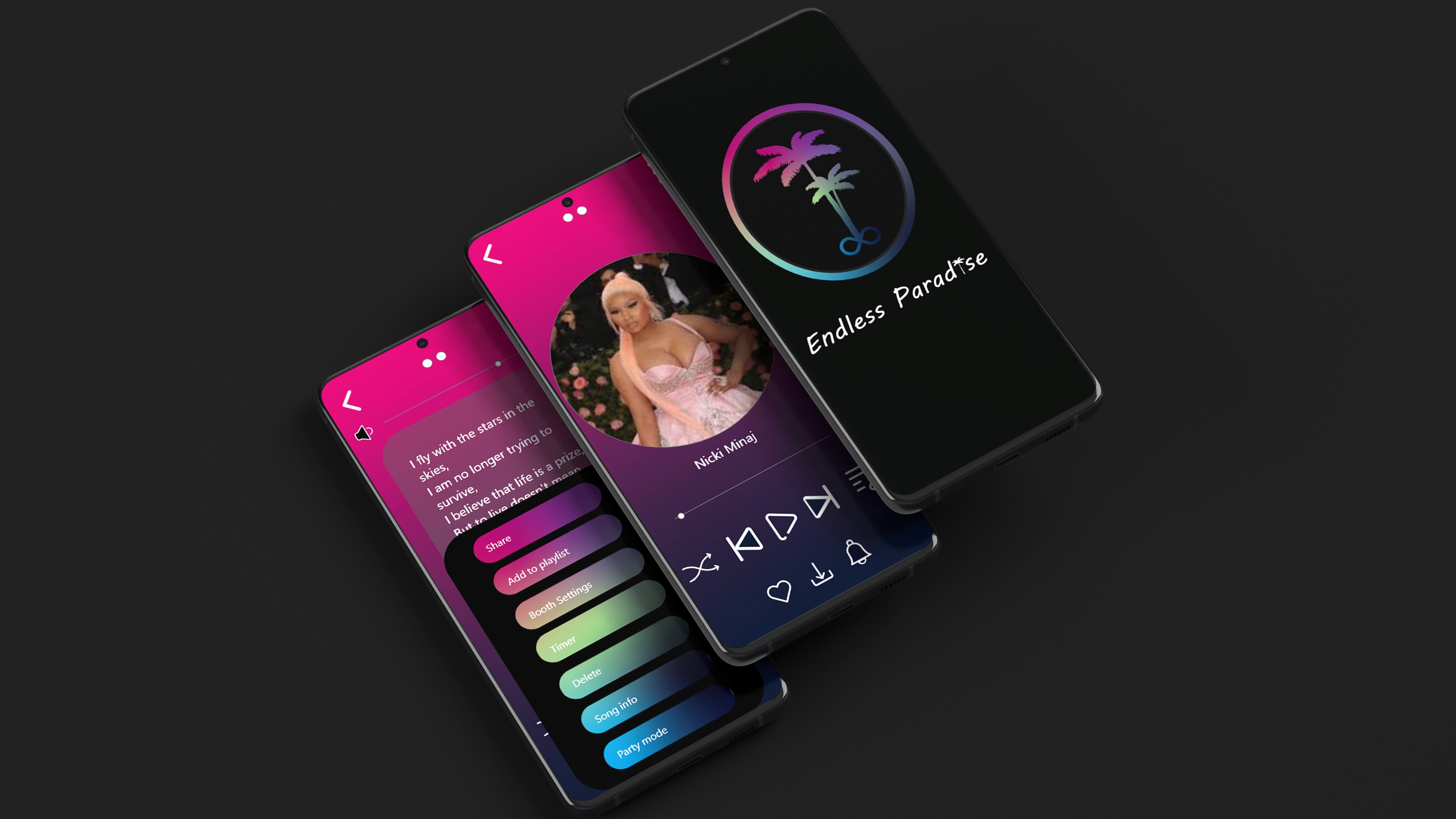
We were briefed to create a mobile app that would be different from the apps already created. We chose an app that would give info about the artist, that would show the lyrics of a song as well and many other features in the app. we went with the name endless paradise because it fits well with the app we designed. We chose those colours because of what the title represents. Our design came out like that because we wanted it to be colourful and engaging to the audience.


Identity Design
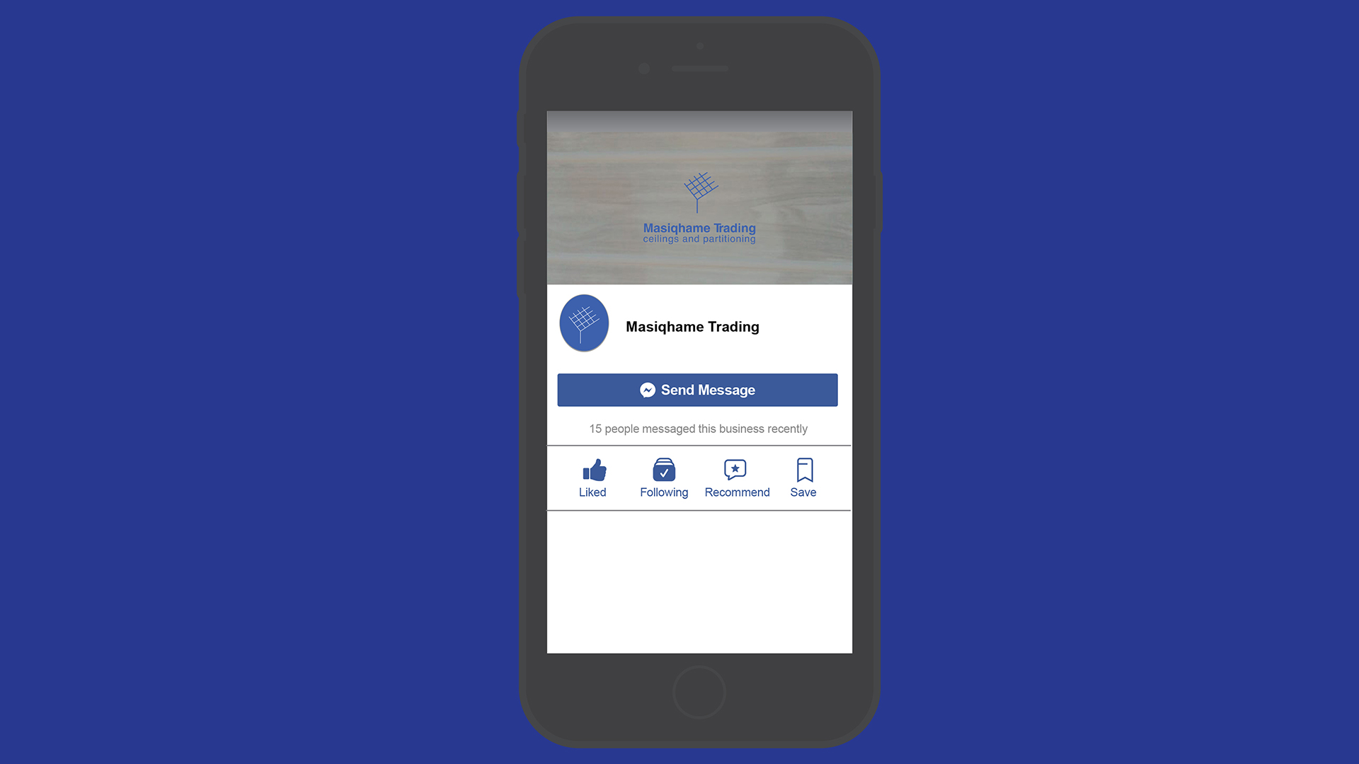
I chose a brand that already existed and rebranded it. I changed the fonts and logo of the brand. I chose the company because I know the owner of the company. They wanted to keep the look and feel of the brand the same, so I decided on a logo that looks like a ceiling they do and change the typography of the words, and added a tagline to it.


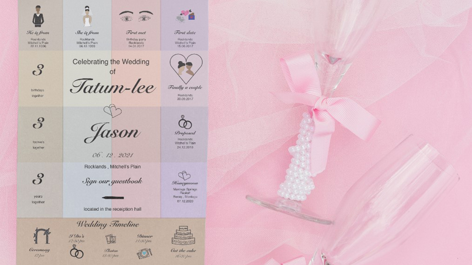
Collateral & Infographic
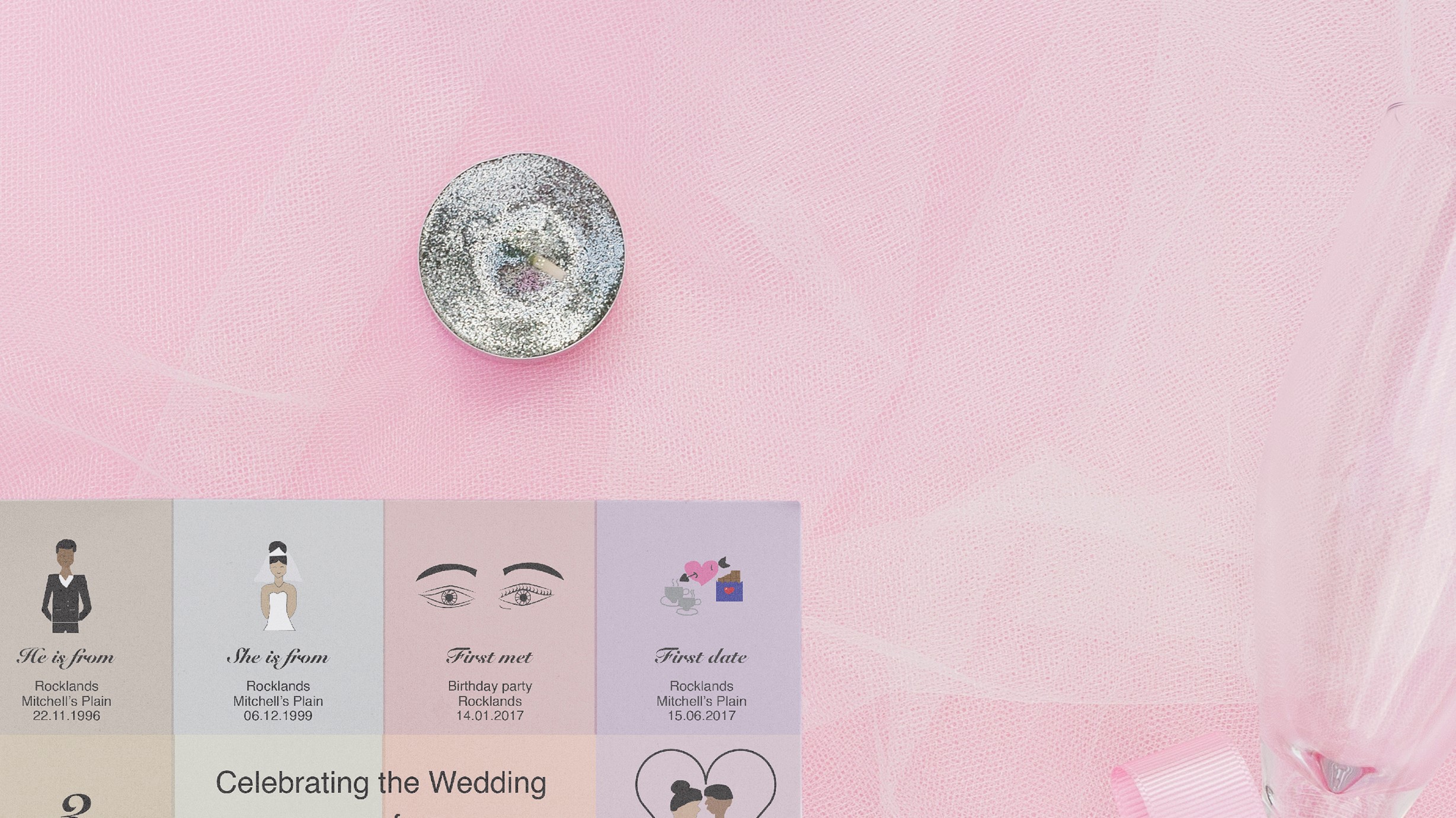
We were briefed to create an infographic and collateral with it. we could choose any idea we wanted to. I chose to do a wedding-themed infographic and a wedding invitation because soon it will be my wedding so I thought why not? then I could explore ideas for my wedding. I chose the check background for the infographic and invitation because I wanted it to be different, many people use floral for their invitations and I did not want to do the same I chose a timeline on where our journey started up until where we are now and in here are the final result of my collateral and infographic design.


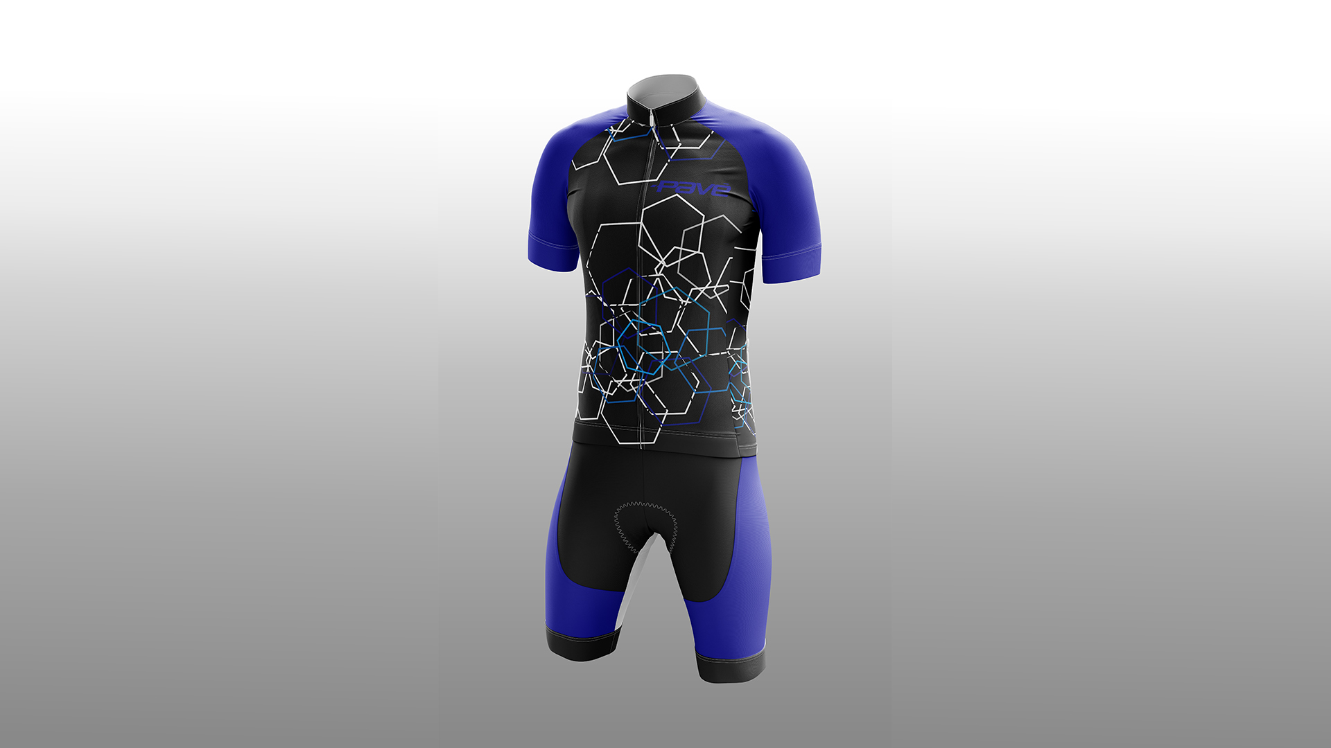
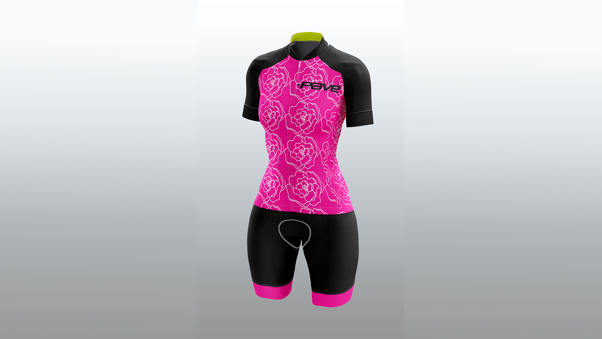
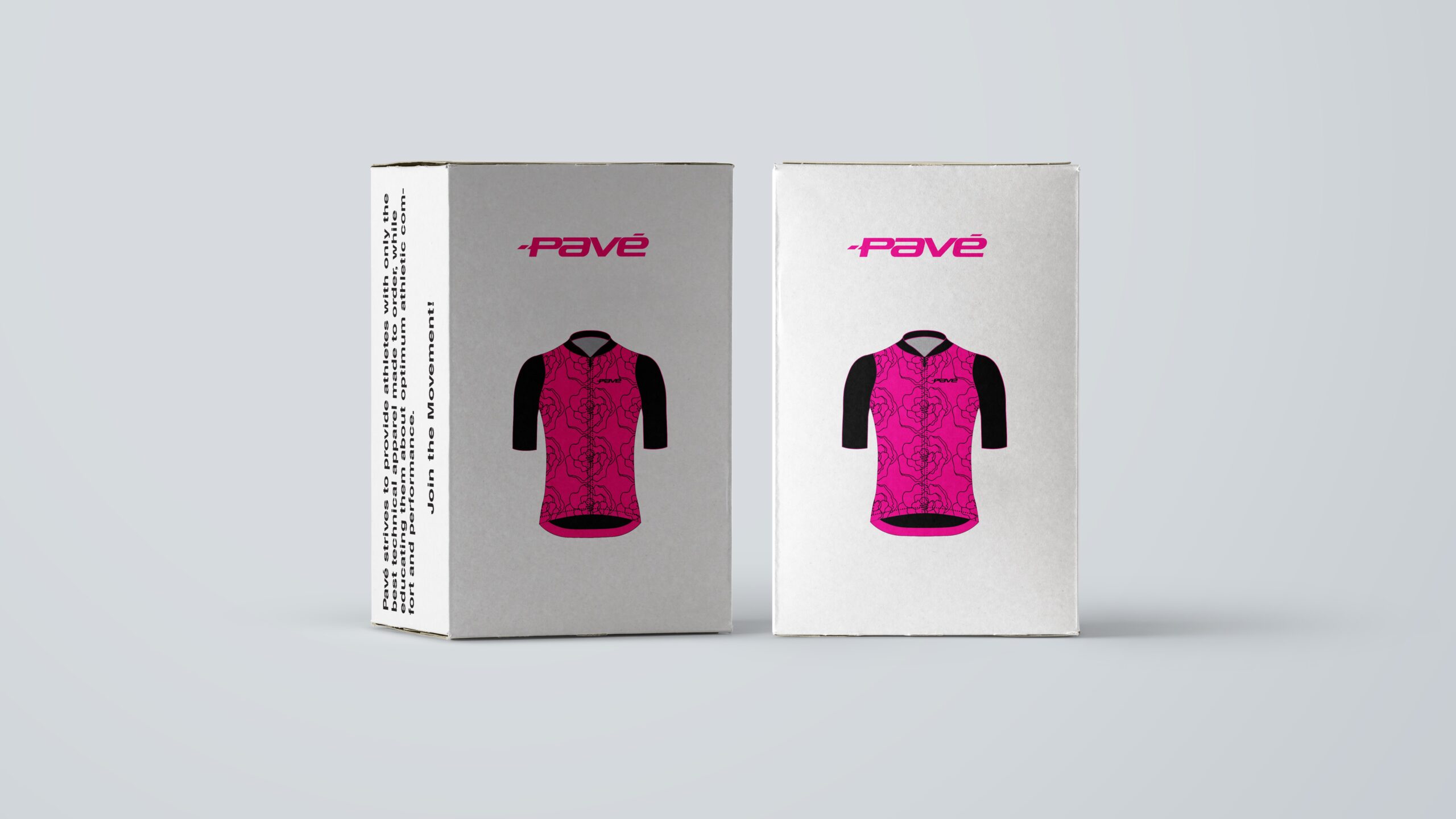
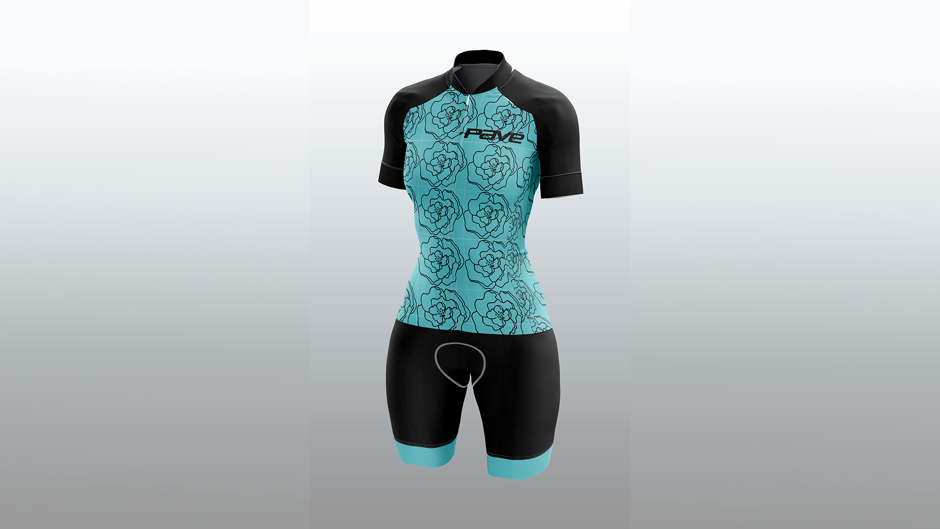
Apparel Design
We got a brief to design Apparel for a company. I designed 2 ladies’ apparel and 2 men apparel. the ladies are both floral designs because I haven’t seen any floral designs on their brand before and I knew women would be interested in it. one design was pink and the other blue. the men’s colours were both blue but had different shapes on them. I chose those designs because they looked much suited for the brand.