SINGITA WESTON
![]()
![]()
![]()
Hi to everyone online. I am Singita Weston also known Sing West for my creative work. I am a visual communication designer specialising in Graphic Design.
I create work which centers around the concepts of sustainability and simplicity. I believe that design can be used as a tool to create positive change in the world around us. My strengths lie in green packaging design, colour, communication and critical thinking.
I am dedicated, confident and light hearted. Memorable moments which stood out for me while studying at Red&Yellow would be collaborating with like minded and diverse individuals who have inspired and motivated me to where and who I am today as a creative.
I wish to continue doing what I love, which is sharing my creative thought and skills and develop work which will shape and connect the world around us.
Thank you.
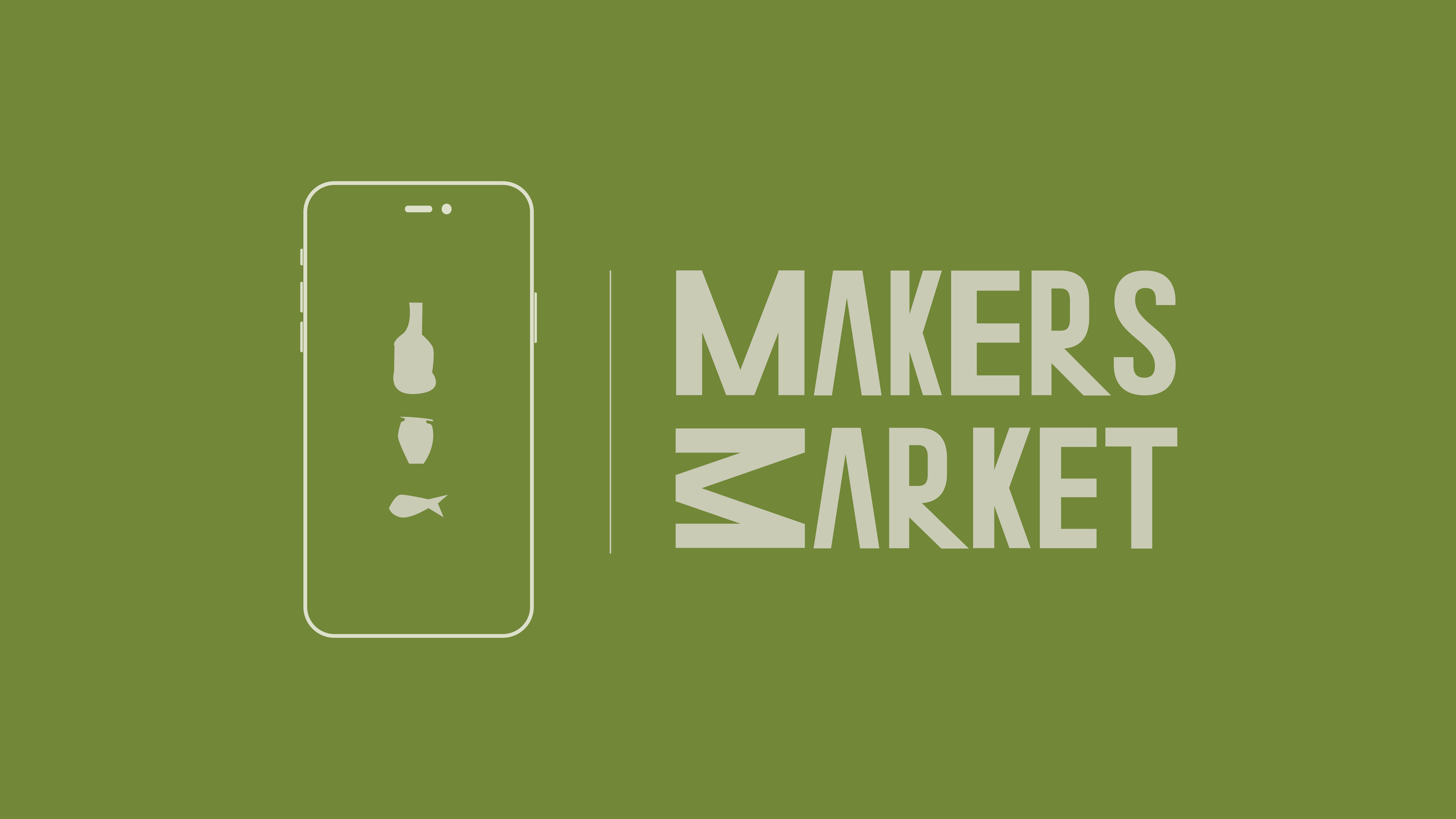
Makers Match
The food industry as we know it is unsustainable. There is; food waste, excess plastic usage and often imports are supported over local produce. During lockdown individuals have had more time on their hands, less options at the shops and have in turn started creating their own homemade products.
Makers Match is a network which allows individuals to connect and swap their homemade products without any monetary exchange. Once users have matches on the app they meet up at secure certified swap pods where the exchange is facilitated.
 Makers Match
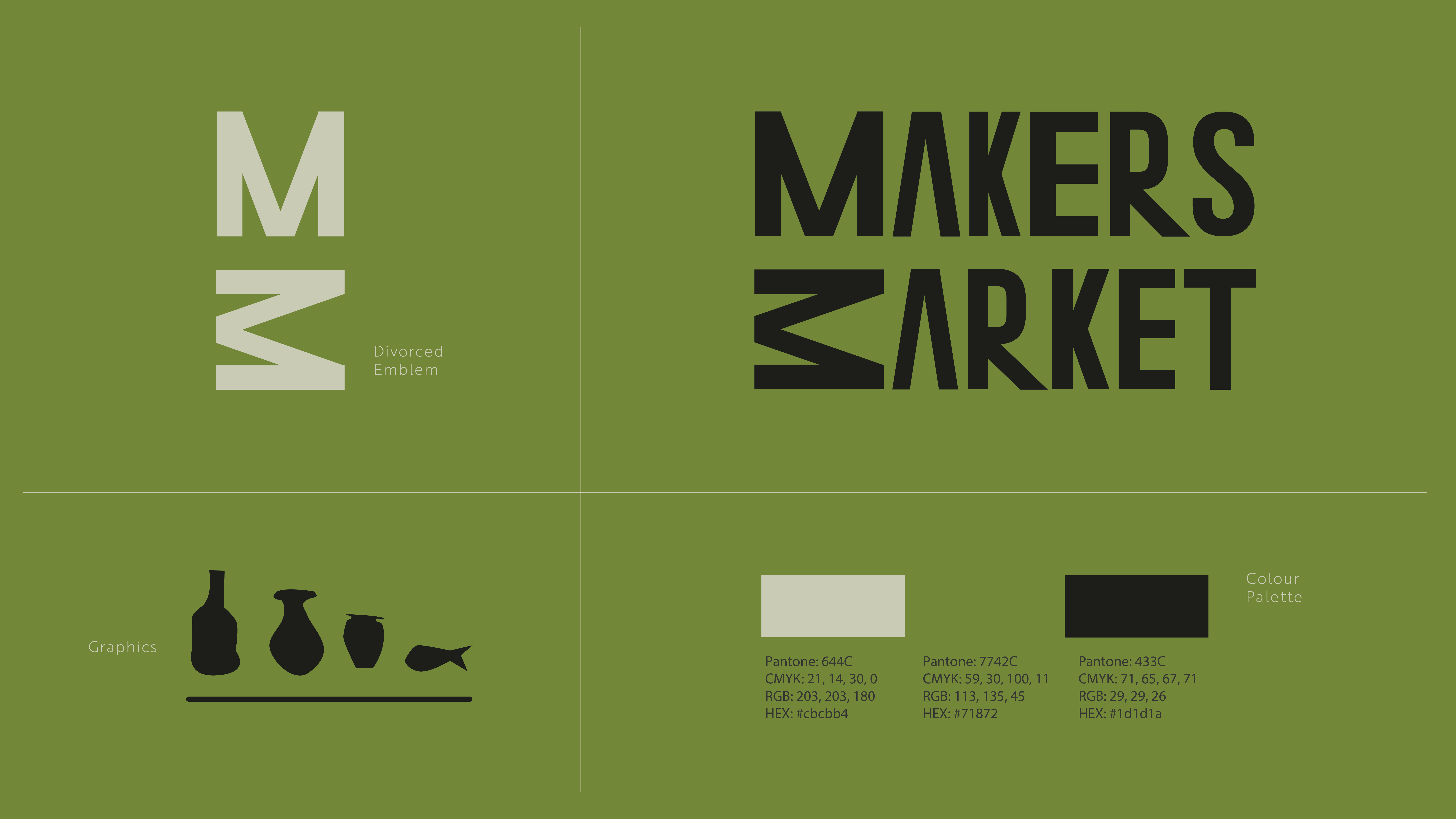 Makers Match
Wild Womxn
A corporate identity including branding and collateral were to be created for a festival to celebrate a small town in South Africa. Tarkastad is a town in the Karoo which has two distinct mountains which resemble female breasts.
The town is similarly well known for its Khoisan art. I chose to merge both insights and create a festival which celebrated the female body while being influenced by Khoisan traditions which celebrated the moon. The festival will be held on top of the mountains at full moon and will include sacred practices from the Khoisan woman.
Collateral includes: festival band, moon cup, Instagram account and posters.
 WILD WOMXN
 WILD WOMXN
 WILD WOMXN
 WILD WOMXN
NŪD active wear
The brand NŪD was developed as a response to an active wear brand identity brief.
The insight identified through research was that inner and outwear often do not fit together comfortably. This being specific to underwear as it is often difficult to find the right underwear to work out in. This problem was specific to all genders. Our solution ensures that all items of clothing exist in a symbiotic relationship working together as an ecosystem; an extension of your own body. We believe that clothes are the home for your body and the best architect for your body is you.
Collaborators: Gabriella Fish and Simon Wiley
 NŪD active wear
 NŪD active wear
 NŪD active wear
 NŪD active wear
 NŪD active wear
PLNT PWR
Packaging design made from biodegradable and dissolvable materials was created as a response to the brief. The design targets busy working professionals and provides convenience while ensuring no environmental impact.
The packaging consists of 14 small transportable packages which house dissolvable plant medicine sachets that fit inside a larger box. The idea is that the sachets can be easily packed in and taken on the go.
The box uses structure as well as colour therapy to guide the patient through their two week course.
 PLNT PWR
 PLNT PWR
 PLNT PWR
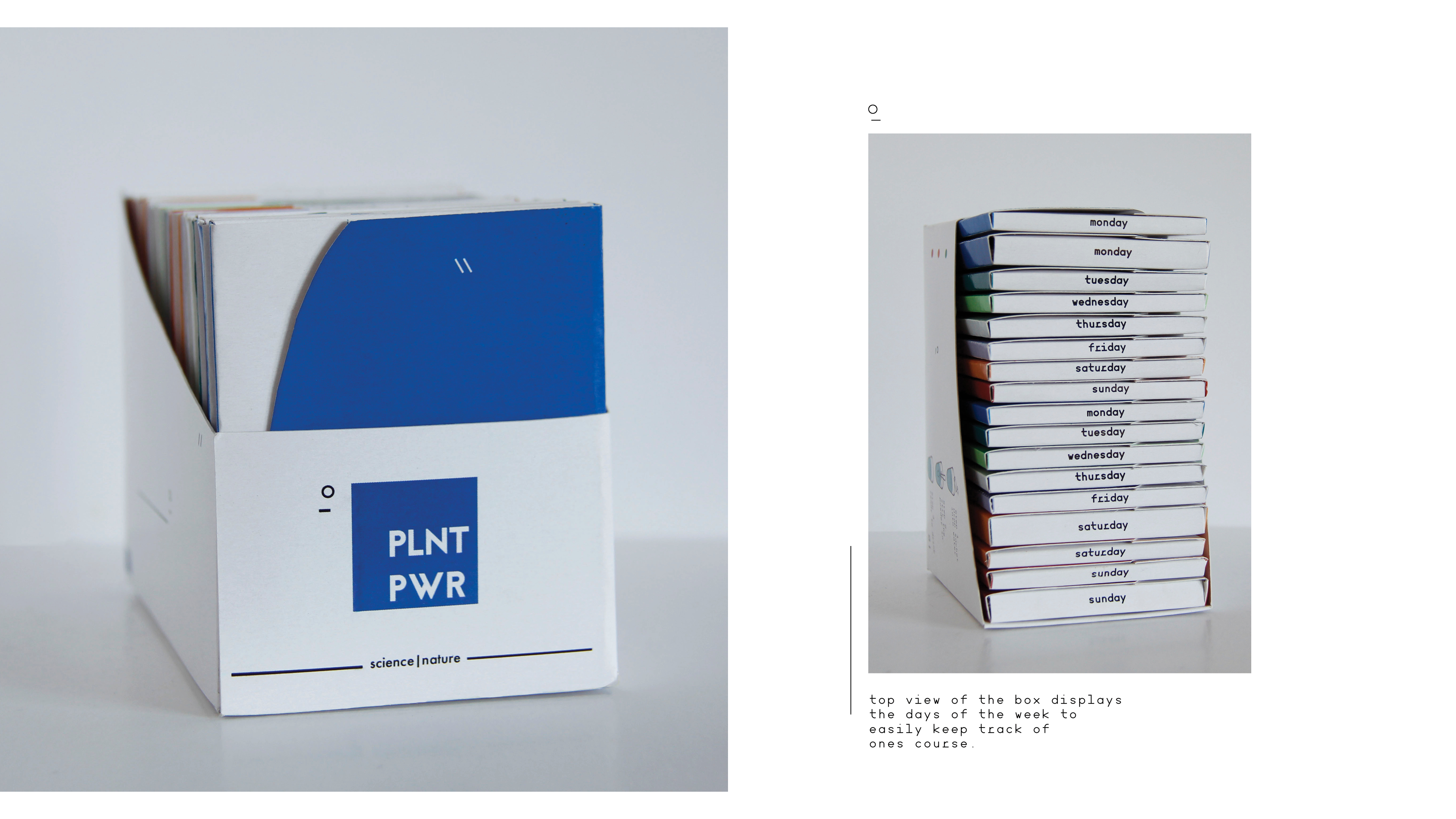 PLNT PWR
 PLNT PWR
Ukuthetha
Ukuthetha “to talk” in Xhosa is a publication series created to promote dialogue around COVID protocols in townships of South Africa. A typeface was designed specifically for the zine series and took inspiration from hand painted signs found on many spaza shops.
The zine series consists of three zines; Tap Talk, Toilet Talk and Top Tips. The zines are A6 in size and can be easily transported in one’s hand or pocket. When unfolded an A4 poster appears which can be stuck up in communal areas to spread awareness.
 Ukuthetha
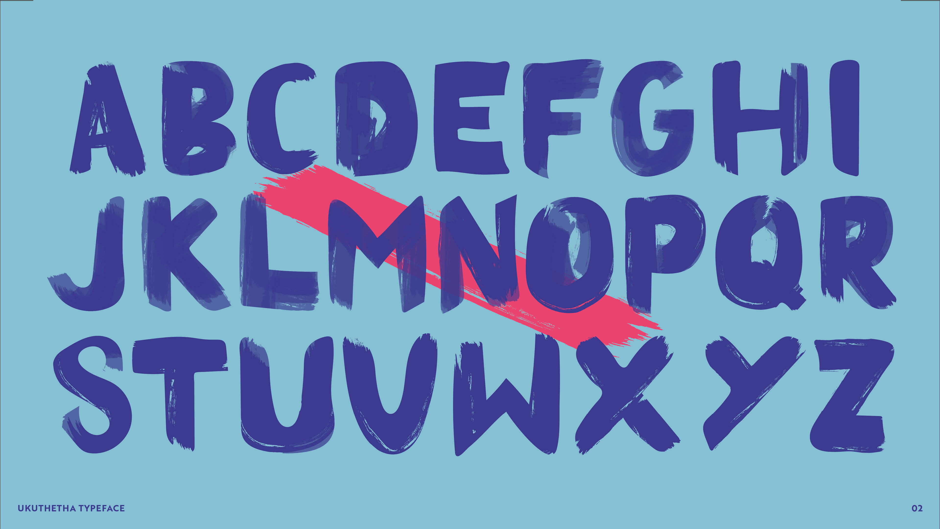 Ukuthetha
 Ukuthetha
 Ukuthetha
 Ukuthetha