MEGAN CAMPBELL
UX RESEARCH | UX DESIGN | INTERFACE DESIGN



Hello! I’m Megan Campbell, a postgraduate User Centered design student at Red and Yellow with an undergraduate Bcom degree in Strategic Marketing Management. I have been deeply challenged this year and have grown my skills in design and research. Both in teams and individually.
I have a passion for people, and hope to one day be able to use the skills that I have learnt during my tertiary education to make a valuable contribution to the society that I live in by empowering those that are less fortunate than me.
I grew up on a fruit farm in Zimbabwe where I developed a passion for the bush. I love going on camping trips and spending time with my family. In Cape Town, I enjoy spending time outdoors in the mountains and watching sunrises with friends.
About me
Brand Challenge
A 6-week Brand Challenge project working with both strategists and creatives to provide an innovative solution to Zip Zap Circus’s business problem. We came up with a creative campaign that aimed to increase Zip Zap’s individual donor base in and around South Africa.
We developed a concept stemming from the insight that Zip Zap teaches more than circus tricks, they teach skills for life and teach children vital aptitude skills. Students go on to be employable and valuable members of the community who help create positive change.
The success stories that donors become a part of aren’t just stories of the individuals that are helped, but the success story of all these individuals collectively creating change in a show called life.
We decided to make physical manifestations of these aptitudes and link them to relevant circus performances that are taught at Zip Zap, such as juggling and trapeze. Not to mention that this concept set us up for an exciting task to imagine soft-skills through physical character traits and quirks. These characters represent the way the respective skills are learnt and show how they can positively influence the community. Because everyone likes someone who shows Leadership, Courage, Adaptability, Determination, Trust and Communication.


Independent Study
In this year long brief, we followed an iterative process from ideation to final prototyping. We had to find a problem and come up with a digital solution (either a mobile app or a website). My final product is a Web-based platform called ‘Amandla’, which means empower.
I came up with the idea for this platform after having a conversation with some of my friends around the difficulty in finding a charity in our area that we felt would really put our clothing and other second hand items to good use. Although there are many charities around that are in desperate need for food, clothing and money, Especially during COVID-19 lockdown, we felt that the donation process was impersonal, and it was difficult to find charities, especially the small, start ups, that we really connected to. I realised that there was a deeper need among certain people to feel as though they are making a REAL difference in the lives of their community. People want to donate to projects that their friends and family are involved in, and for the donation process to be simple and not time consuming. I wanted to find a solution to this problem, something that makes donations both simple and useful, that makes people feel like they are connected to a community that wants to play their part in helping vulnerable South Africans.
The Problem: People want to use their resources to make a difference in the lives of underprivileged people BUT don’t have the time/money or energy to do so.
The Solution: To create a web-based platform that is informative, community based and that provides a donation collection service.


Open Music Archive
The Open Music Archive (OMA) website is severely outdated and complicated. It’s navigation system is confusing for users and the way that its content is sorted does not follow any clear system or hierarchy. Users are unable to browse through various music items through the use of any filters, the tagging system is unstructured and the website does not function as one cohesive whole. It therefore needed a redesign to meet its users’ needs.
The website re-design focused on the Browse page and the homepage.


Between 10&5
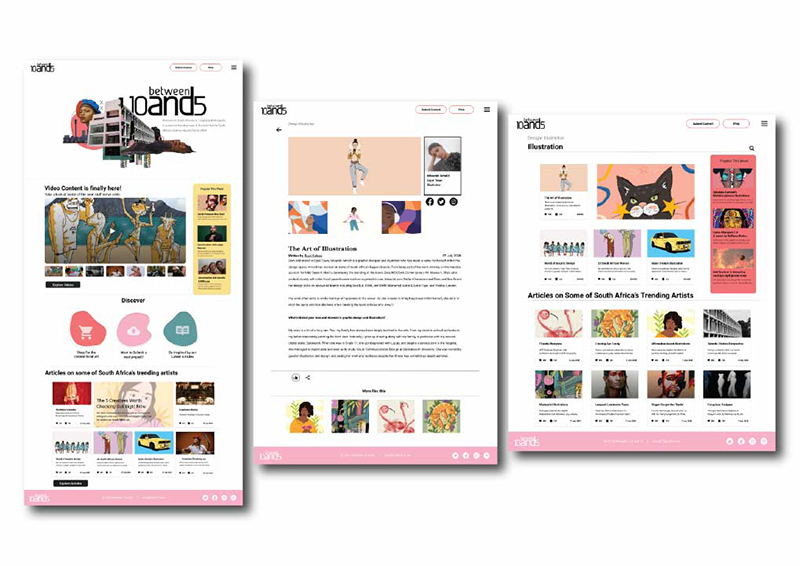
The purpose of this brief is to document the process of our redesign proposal for Between 10and5’s website. We conducted user and design research to highlight critical areas that needed to be improved based on the business and users needs. The redesign will target key pain points as well as reimagining the direction of between 10and5 as a platform. The process was guided by the application of fundamental principles of design to improve the interface and interaction design.
The Problem: The main purpose of the website is to provide a digital publishing space for SA creatives, However, the content on the websites’ homepage does not offer a clear indication or sense of navigation for their users which means that users can get overwhelmed by the amount of different content they encounter as soon as they get onto the website. According to Uno De Waal, a move towards increased video content is a viable route for growth of the business, which means that it will need a complete redesign in order to be more engaging and become a main point of the site. Overall, the website seems to offer no clear direction with their content placement. The different content categories are all placed on the homepage without them being divided into separate parts.
The Solution: Through an iterative design process, the solution is to:
– design a website with Improved global and local navigation bars to be accessible constantly throughout the site.
– Simplify navigation bars to make them less intrusive and have them correspond to user needs.
– Redesign of the video content page to make it more engaging and specific to its users. Also better optimize the homepage to highlight video content.
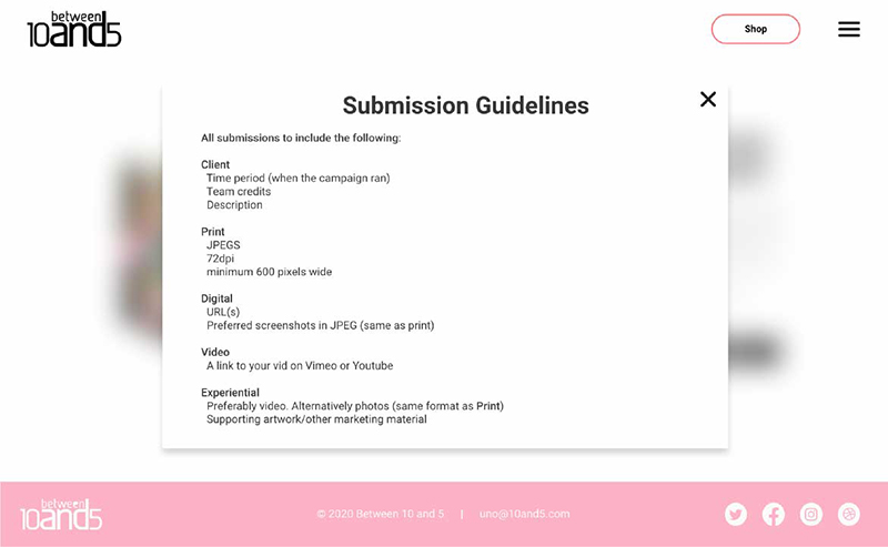
– Make it easier for and motivate artists to submit their work.
– Simplify content structuring – homepage
– Increase variability among the pages so that they are easily distinguishable.
– Reduce the intrusiveness of the site by making the design more soft and inviting to the user (improve the use of fonts, colours, type, spatial proximity and layout).
– More interactive design that inspires users.
– Improve the ‘visibility of systems status’ by ensuring the clickable buttons are obvious to users.