ANGELINE DANCIG
GRAPHIC DESIGNER | ART DIRECTOR | CONTENT CREATOR
![]()
Welcome to Danka, my personal brand which is characterised by carefully crafted concepts brought to life in branding, packaging and collateral that encapsulates a core message. I love typography, design innovation, packaging and brand identities, and painting is where I first felt empowered by my creativity and where I learned to be ambitious and sensitive to detail. I always try to create work that sticks with people and pushes the boundaries between function, form and aesthetic. Having an open mind and being dedicated to the craft is what inspires me to bring imagination, attention and energy to each of my projects. My full portfolio and profile can be found here – https://www.behance.net/angelinedancig.
About me
#BareYourEndo
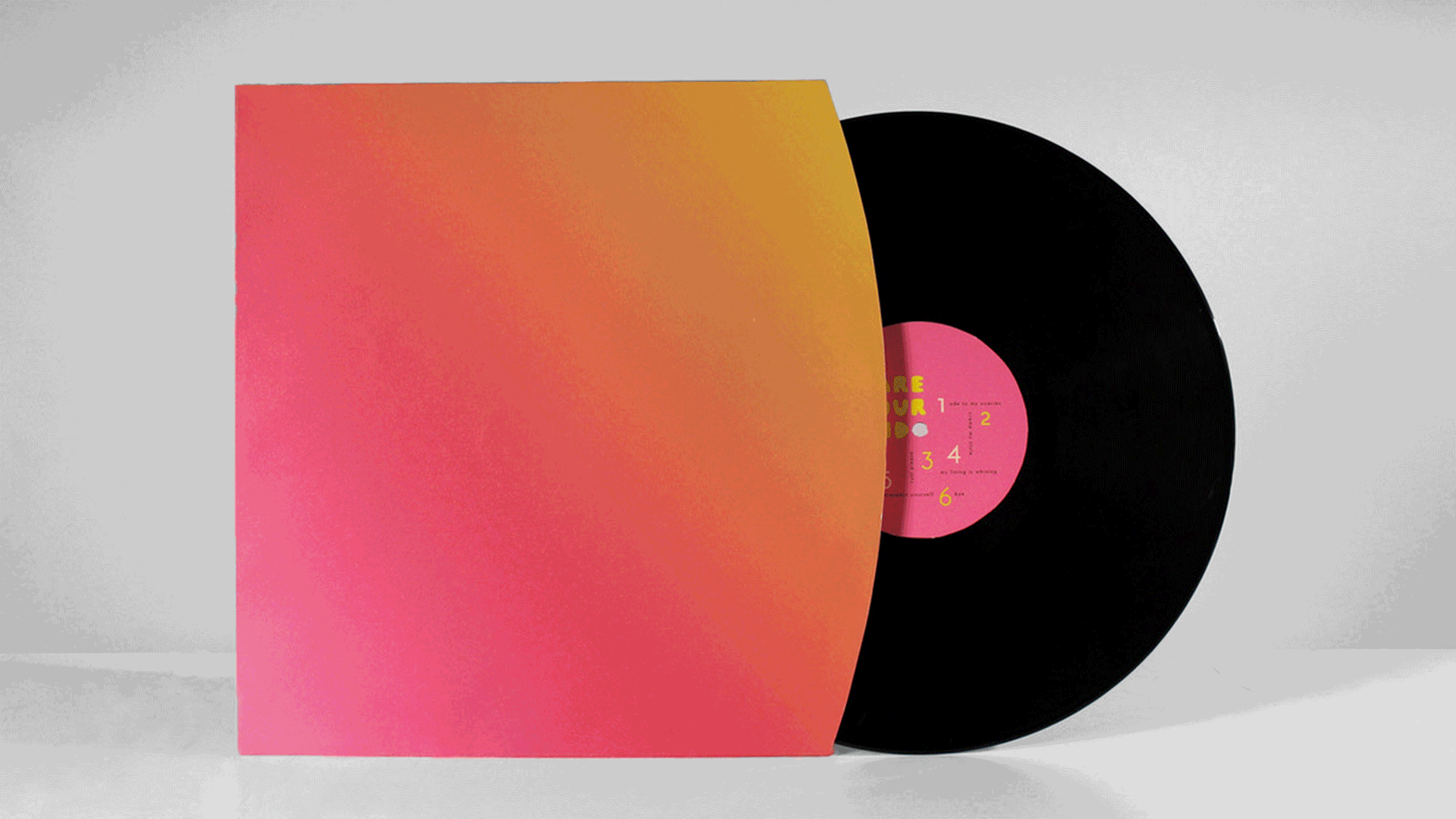
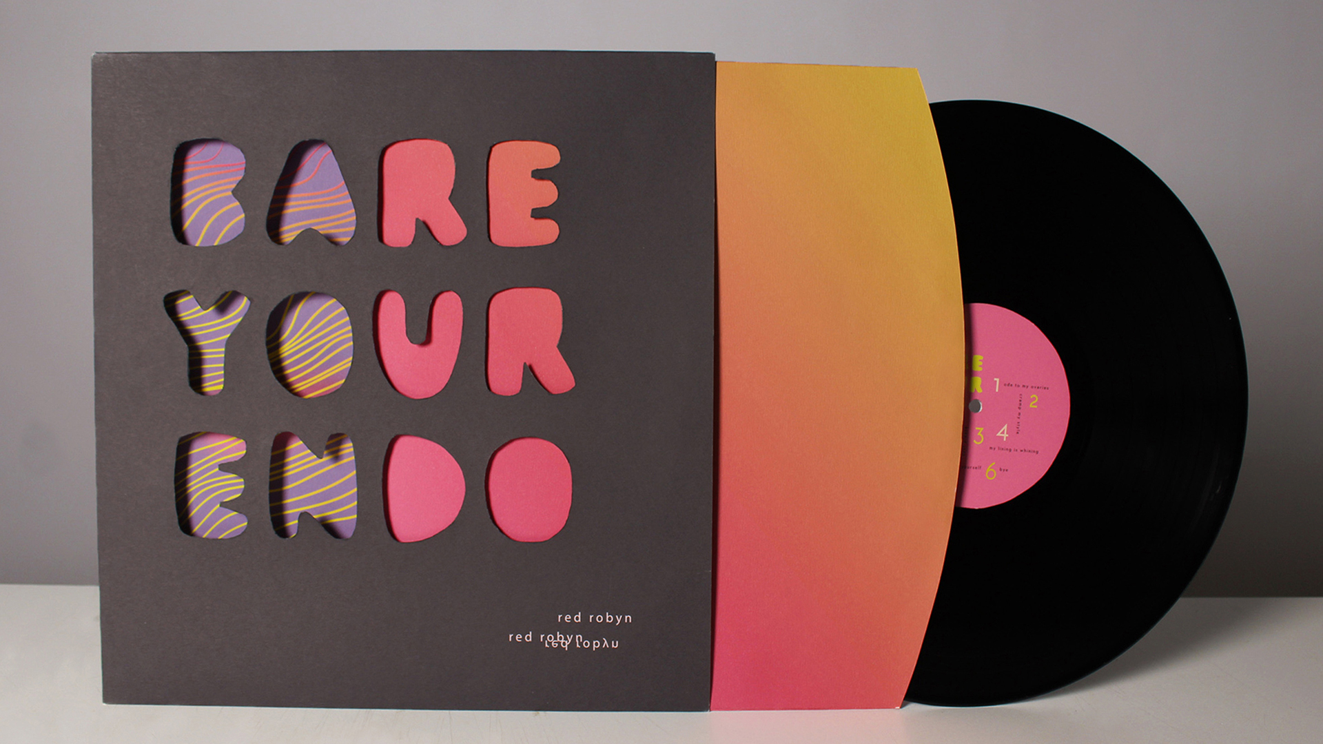
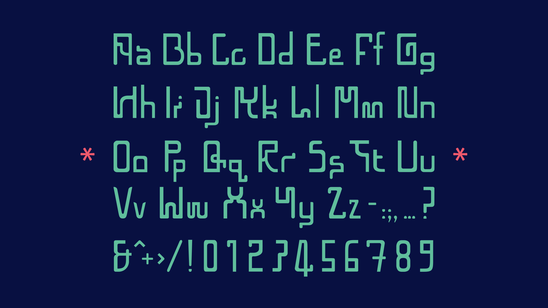
Briefed to create a cause campaign visually centered on typography which is based on a music genre, #BareYourEndo uses bedroom pop music to encourage teenage girls to start talking about endometriosis. The painful disorder – which involves endometrial tissue growing outside of the uterus – is often ignored among girls and young women. Custom typography visually inspired by microcells harnesses the intimate and honest message of bedroom pop music to launch the #BareYourEndo movement. By collaborating with musician Red Robyn to create an album and campaign introduced via Instagram, teenage girls were shown how speaking about their pain can make a difference.


 Bare Your Endo
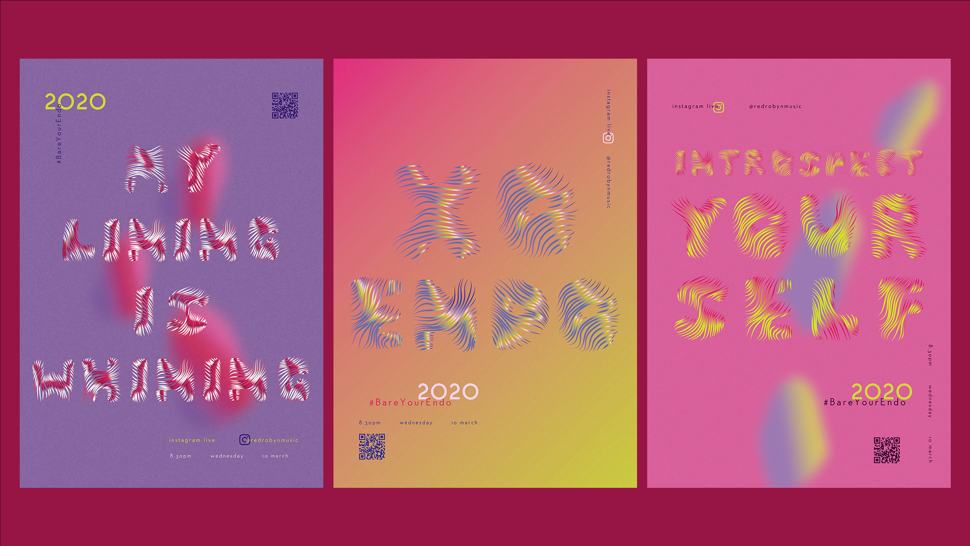
Éviter
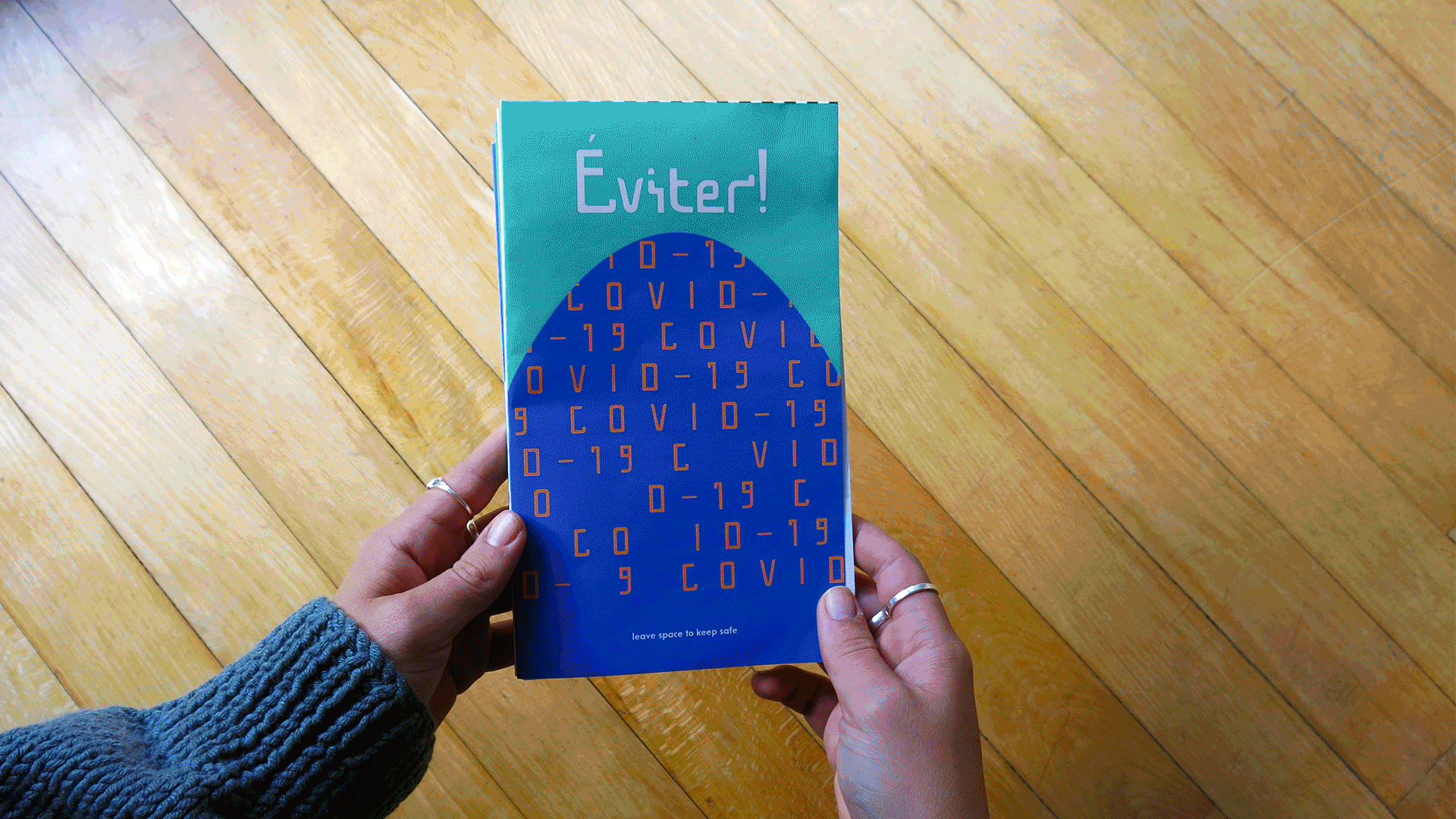
To solve the core need of a South African community vulnerable to the COVID-19 virus, Éviter communicates the importance of the ‘distance rule’ to French–speaking refugees. This group of people already know the difficulties of distance having travelled from west African countries to seek refuge here, but unfortunately the global pandemic requires even more space between loved ones. The Éviter typeface was created to mimic the technique of batik, a west African fabric art process, and was used in an informative zine which, when torn in half, becomes a visual reminder of the one and two meter spacing rule.


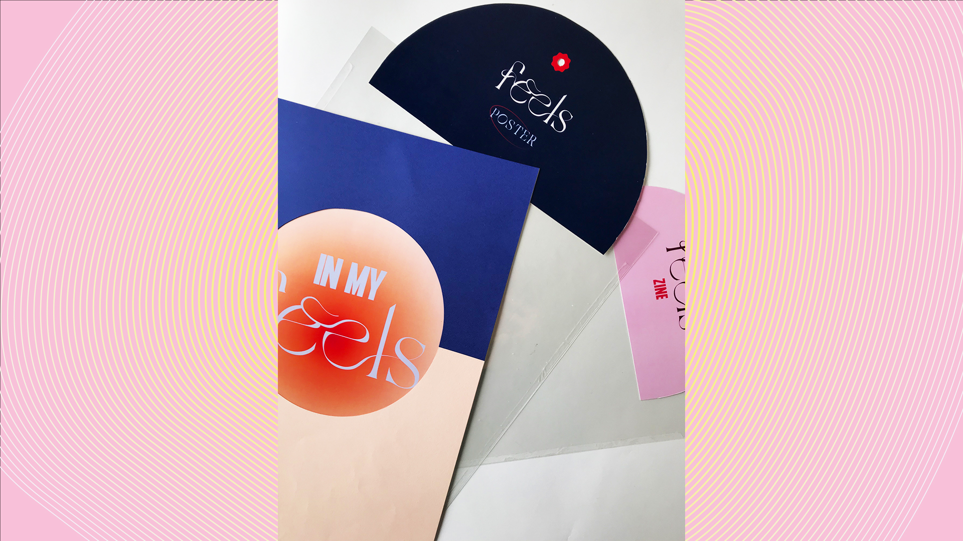
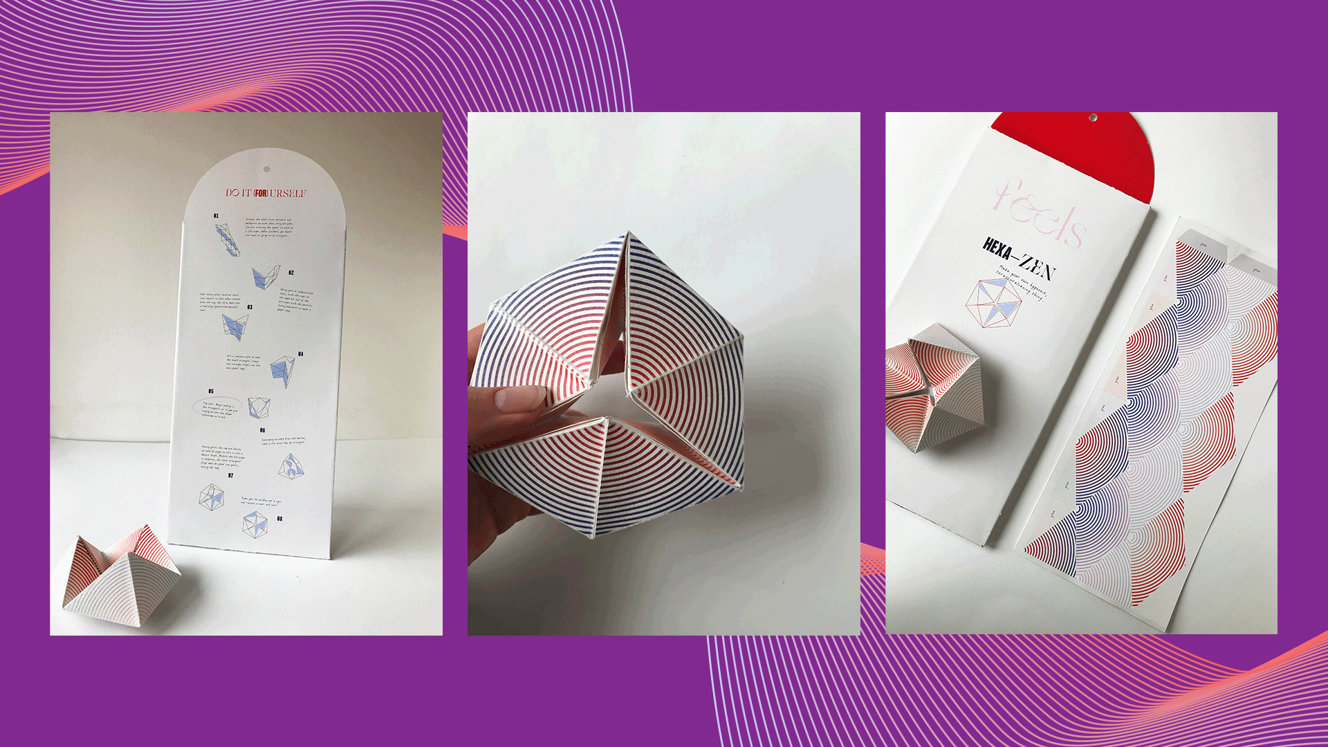
Feels
To answer a self–initiated brief calling for a print–based solution to the issue of digital addiction amongst Generation Z, Feels is a brand which creates paper products as alternatives to electronic–based entertainment. Print media provides opportunities for tangible experiences that 16–22 year olds crave in this digitally obsessed world. Feels encourages their consumers to reconnect with their emotions by interacting with their various analogue products such as zines, devices and posters. The brand focuses on introducing Gen Z to meditation, providing stress–relief, and above all, creating meaningful distractions to social media and digital device use.


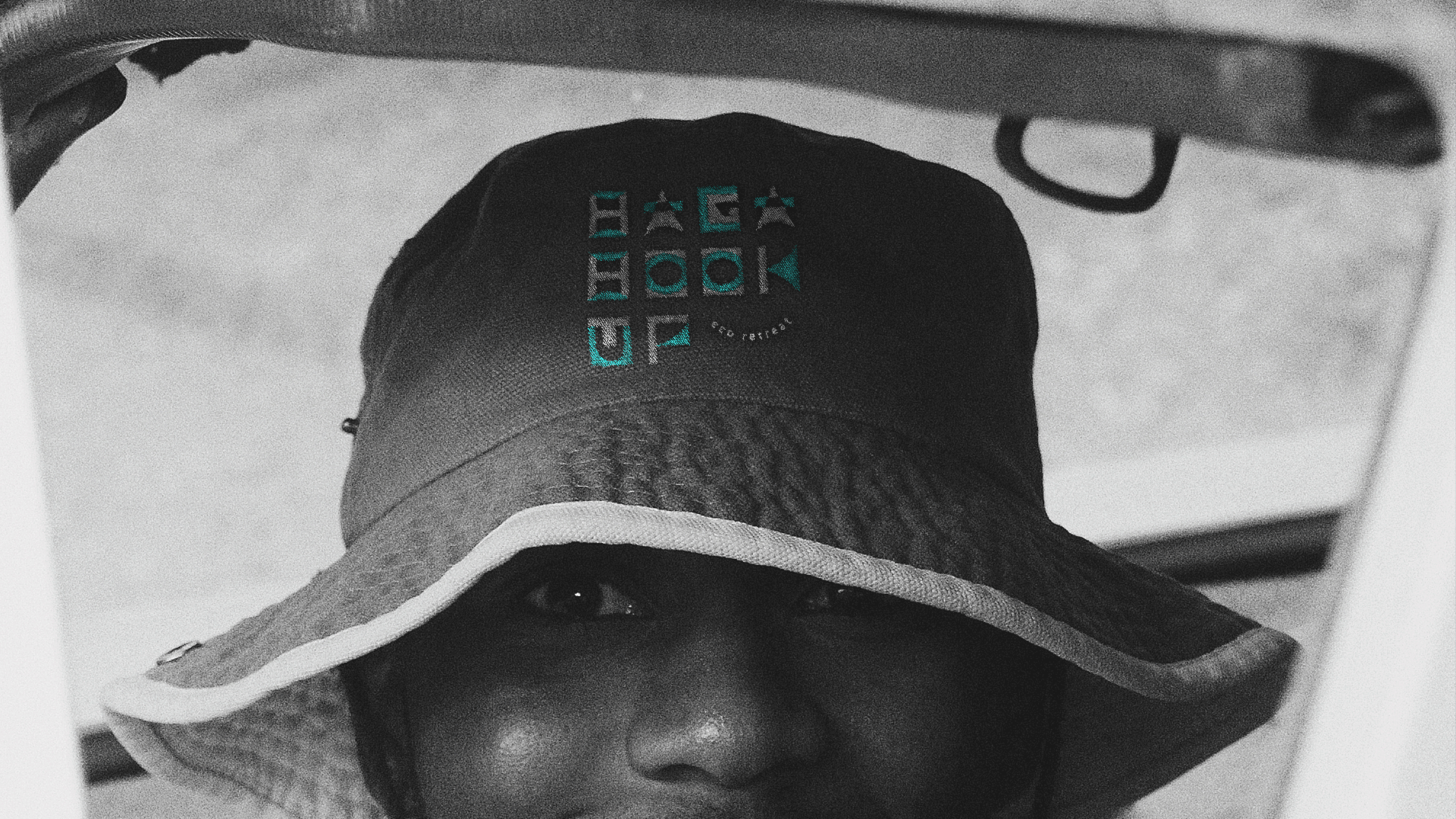
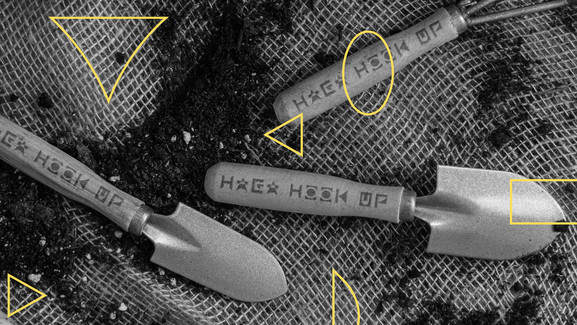
Haga Hook Up
Haga Hook Up was created in response to a brief requiring the development of a corporate identity system for an event in the small town of Haga Haga in the Eastern Cape. The town is situated in an area of unique biodiversity which needs to be protected. Haga Hook Up is an eco–friendly retreat which focuses on an exchange of knowledge between guests and local guides in order to learn sustainable habits. Local guides educate guests about green–living and local biodiversity and are additionally empowered to share this knowledge with their communities to protect Haga Haga’s fragile ecosystem.

Looped
The brief, assigned by M&C Saatchi Abel, called for the development of a sustainable casual wear family brand for Superbalist aimed at young families and couples. Research showed that millennials crave nostalgia through tangible items and seek connections in the clothing that they wear. Looped is a private label family brand which specialises in sustainable knitwear, by using recycled yarn and pure wool to allow South African families the opportunity to relive their dearest memories. The Looped team conceptualised the name, visual world, attitude and tone of the brand and introduced it in a launch campaign consisting of video content, social media, print media, custom packaging and more.

