JÉANELLE VAN DER MERWE
GRAPHIC DESIGNER | CONTENT CREATOR | ILLUSTRATOR
jeanellevdm27@gmail.com
![]()
![]()
Hello and welcome! I am Jéanelle, mamma of Jee Jee designs – my creative playground, which you can see more of here: Behance, Instagram
My love for graphic design evolved when I came to realize the power it has to tell stories and deepen engagement. I find the world and its people to be an inspiring place and curiosity is a tool that helps me in creating work to be as honest and effective as possible.
I have a strong interest in conceptualising and creating visual identities, print collateral, packaging and interactive designs. I like to consider my design direction as the blend between contemporary and classical. Focusing on a minimal and elegant yet playful and bold aesthetic but always aiming to keep it timeless.
These are my creations, each with their own flare and a different story to tell and I hope you will enjoy!
About me
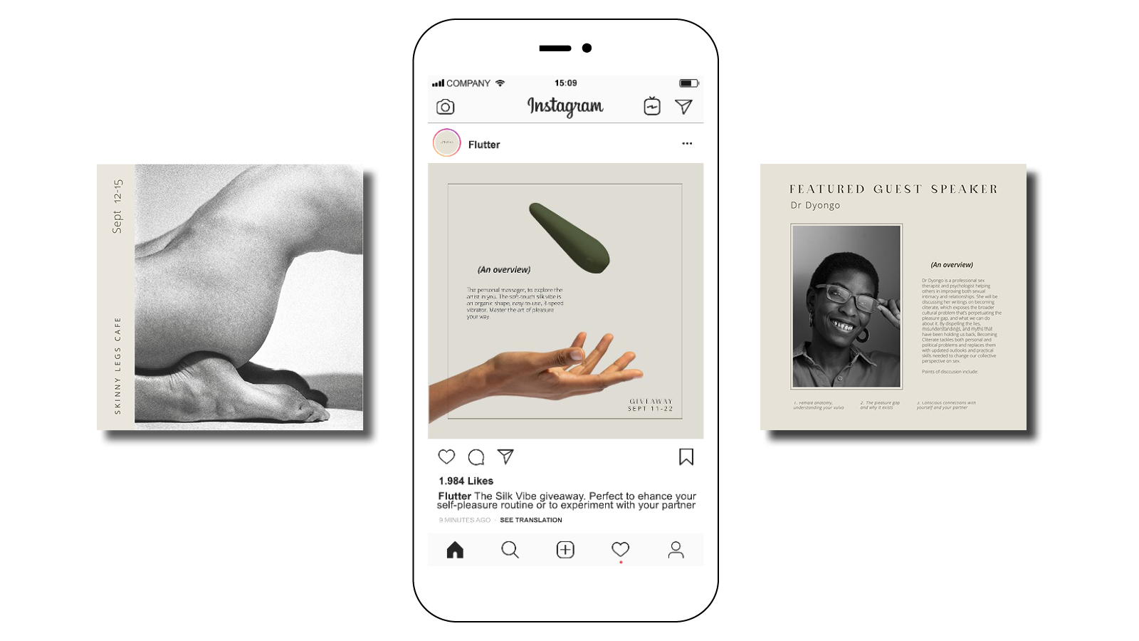
Flutter
Today’s brands are powerful instruments of change and designers want to sell ideas and products that address social issues and aim to change the world for better. The brief called to create a brand that addresses and aims to close the pleasure gap and in turn aims towards combating gender inequality.
Flutter’s mission as a brand is to normalise and de-stigmatize sex products for the female-born consumer, to instead make the purchasing and use of these sex products a more elevated experience. Through the design of an advanced corporate identity that is taking a step away from the more conventional sleezy sex toy branding towards a more holistic and wellness attitude.
Sawubona
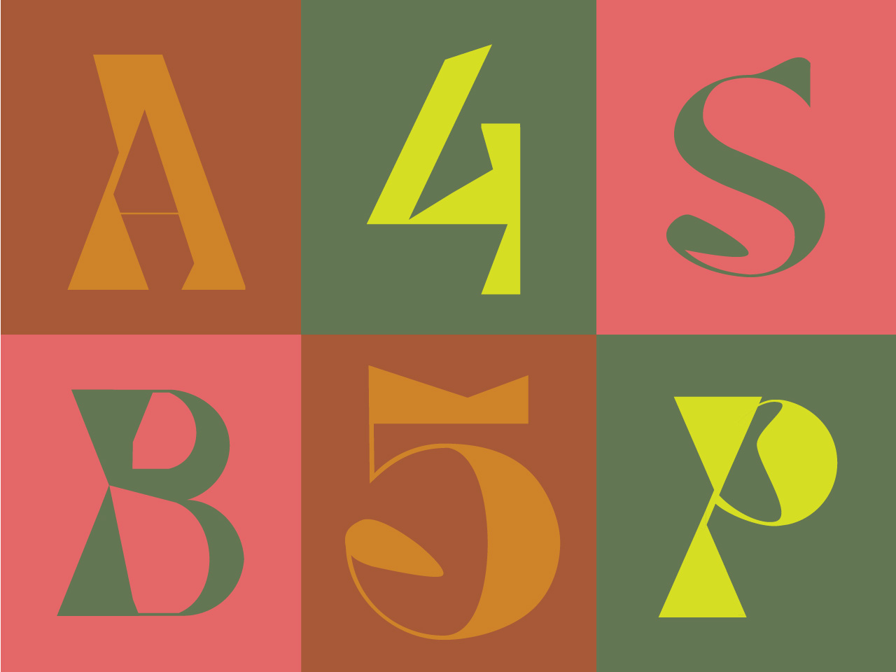
The brief called to design a font that can convey one of the UN’s key messages and then translated in a way that would engage and inform people across different cultures, languages, communities and platforms.
Sawubona is a font that at its essence is about the human experience. The core message is in the name which is an isiZulu greeting and it’s deeper meaning reveals – “I see you and by seeing you I bring you into being.”
A profound and sacred proverb, with a similar quality to that of the word “Namaste.” The zine was dedicated to exploring a new way to preserve our human connectedness and presence during a time of physical distancing and this evolutionary shift, which is hopefully bringing mass realisations of our true humanity.
Copyright of photographs used by S.J “Kitty” Moodley.
 Type design in a pandemic: Eye see you.
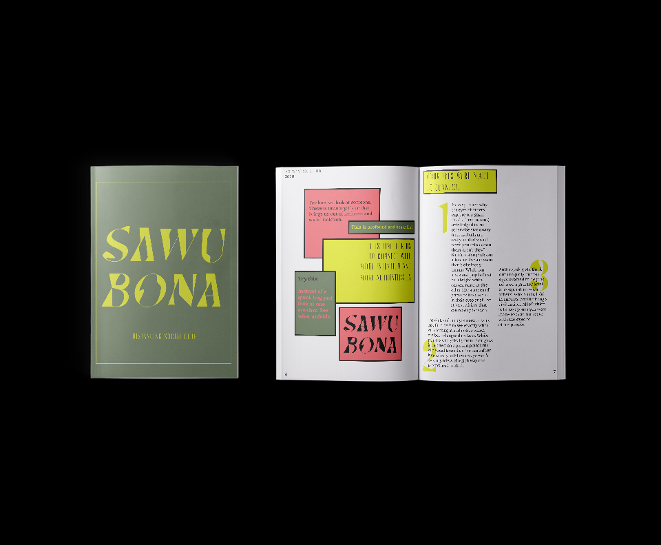 Type design in a pandemic: Eye see you.
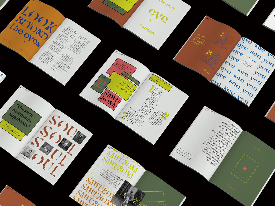 Type design in a pandemic: Eye see you.
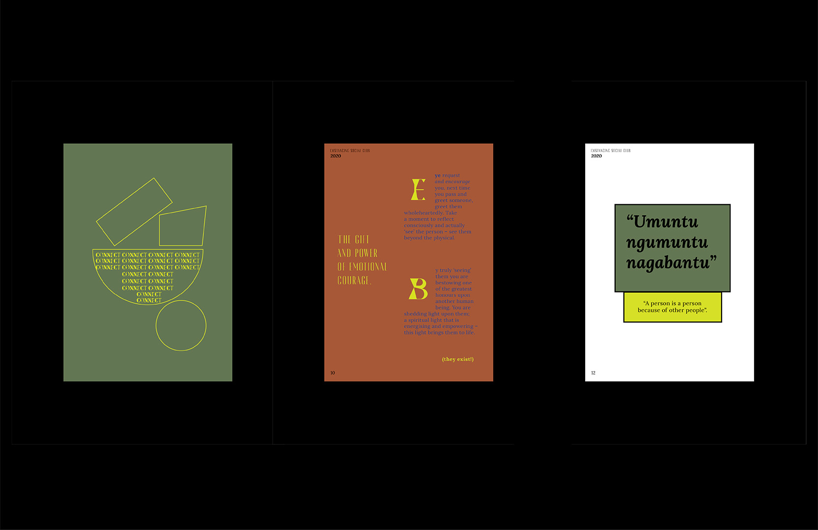 Type design in a pandemic: Eye see you.
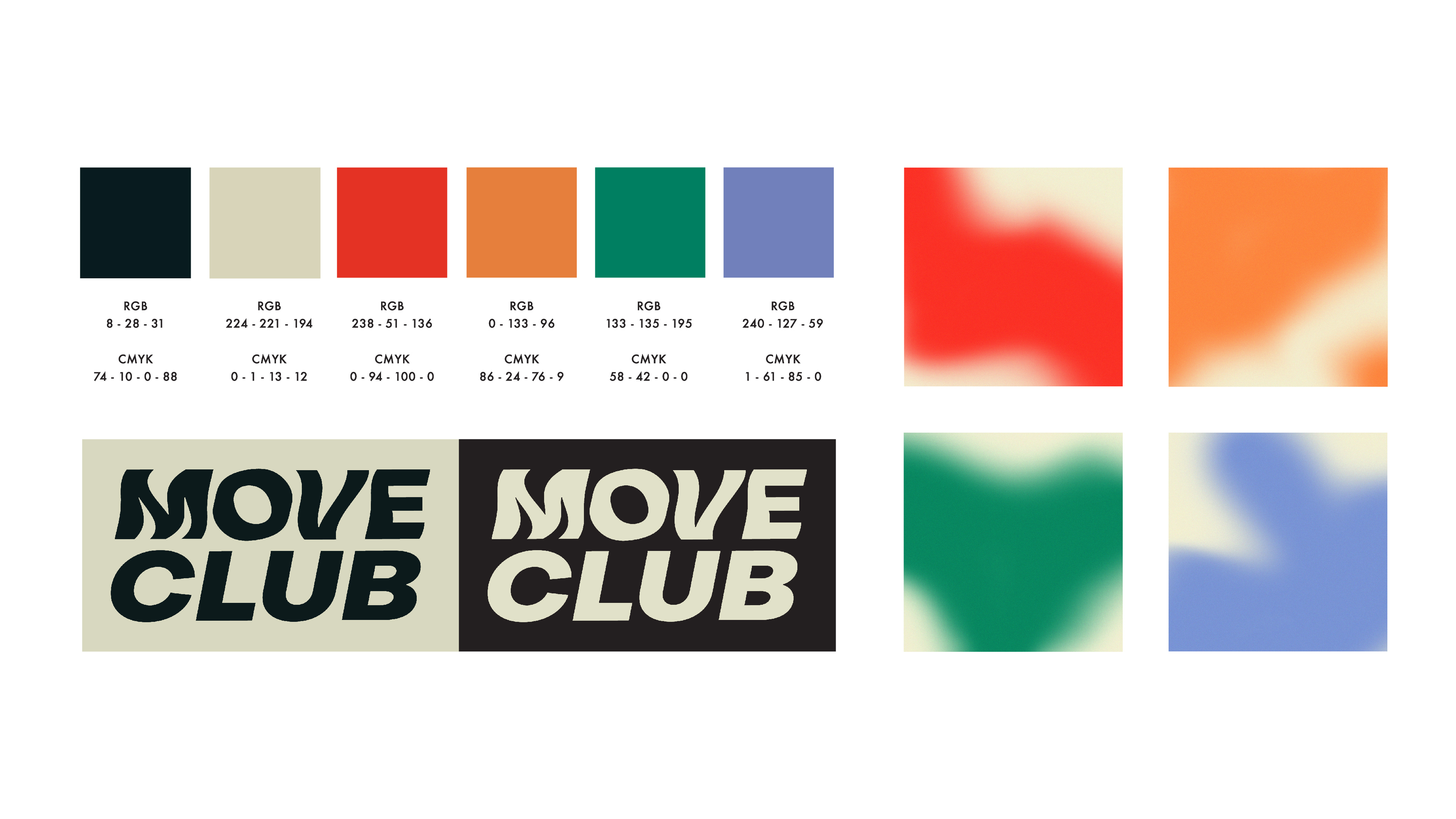
Move Club
An activewear brand that goes beyond merely persuading people on- the-go to buy the latest on-trend activewear. We wanted to create an inclusive brand. A brand that embodies a sense of community. A club. Move Club. Our concept is based on changing the conversation around fitness.
Moving away from competitive and traditional active-living and rather lets potential customers know that Move Club celebrates all forms of movement. With Move Club, everyone’s invited to let loose and be their best selves. There’s only one rule: whatever your groove is, do it your way.
Team members, Camille De Villers, Chloë te water Naude, Yenziwe Nhlabatsi
 Superbalist private label: Move club
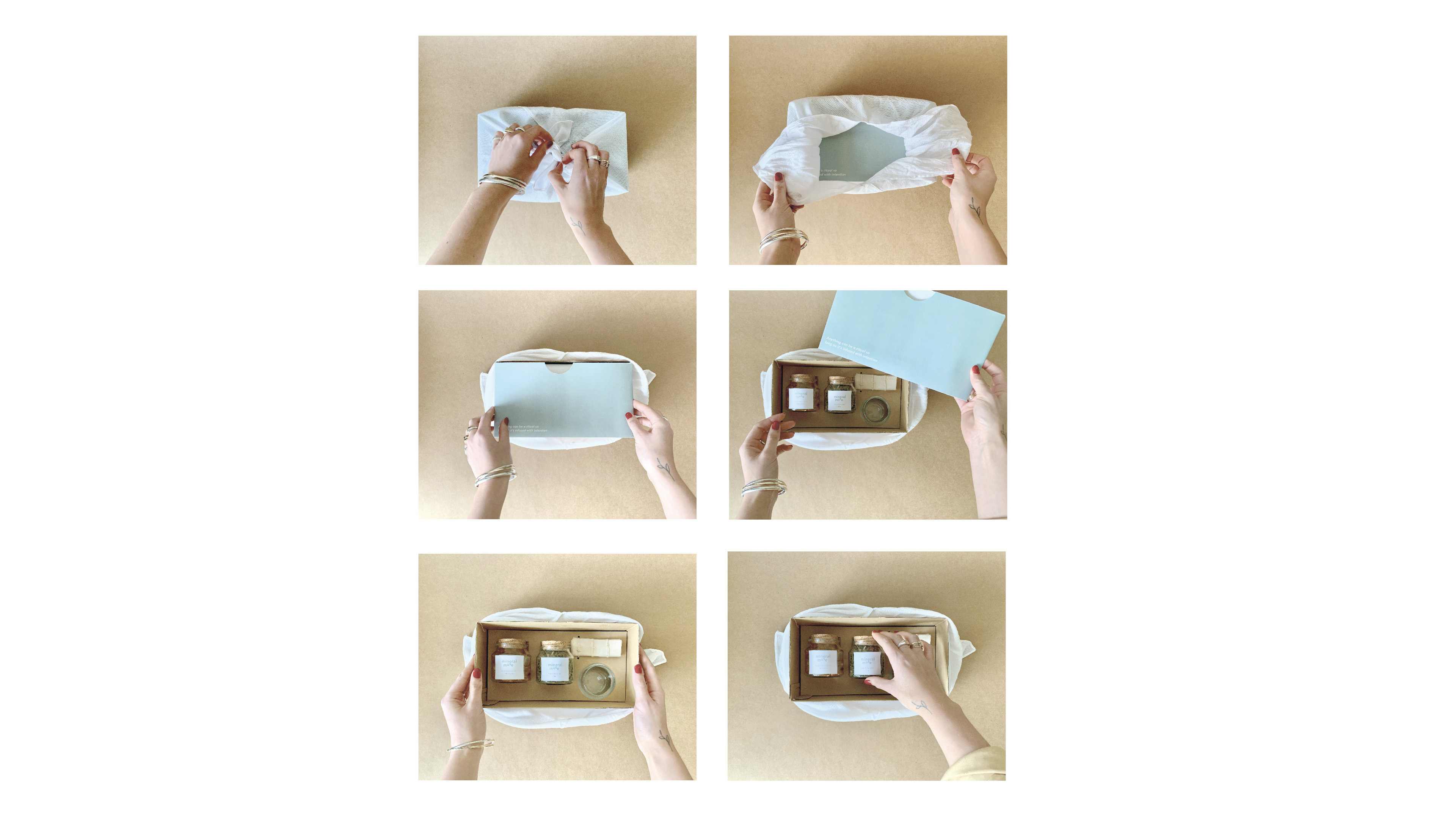
Mineral Muse
The brief asked to co-design with a user, packaging for the Pharmaceutical industry and to re-conceptualise a pill pack for this users medication along with other care items that cater to their needs.
Mineral muse is a care pack dedicated to different women’s life phases and their bone health (aka Osteoporosis.) The brand offers a three phase product range, Pre, Mid, and Post, which caters to the specific phase.The range which is invested in a more mindful and holistic approach to prevention and healing whilst also sharing esoteric content for the user to engage with. Placing the concept of ritual in the center and making the pack more than what meets the eye.
Copyright of photographs used on infographics Karl Kruger, Klaus Rinke and Agnes Martin. The rest of the photographs are students own.
 Mineral Muse: A post-humanist perspective on packaging design.
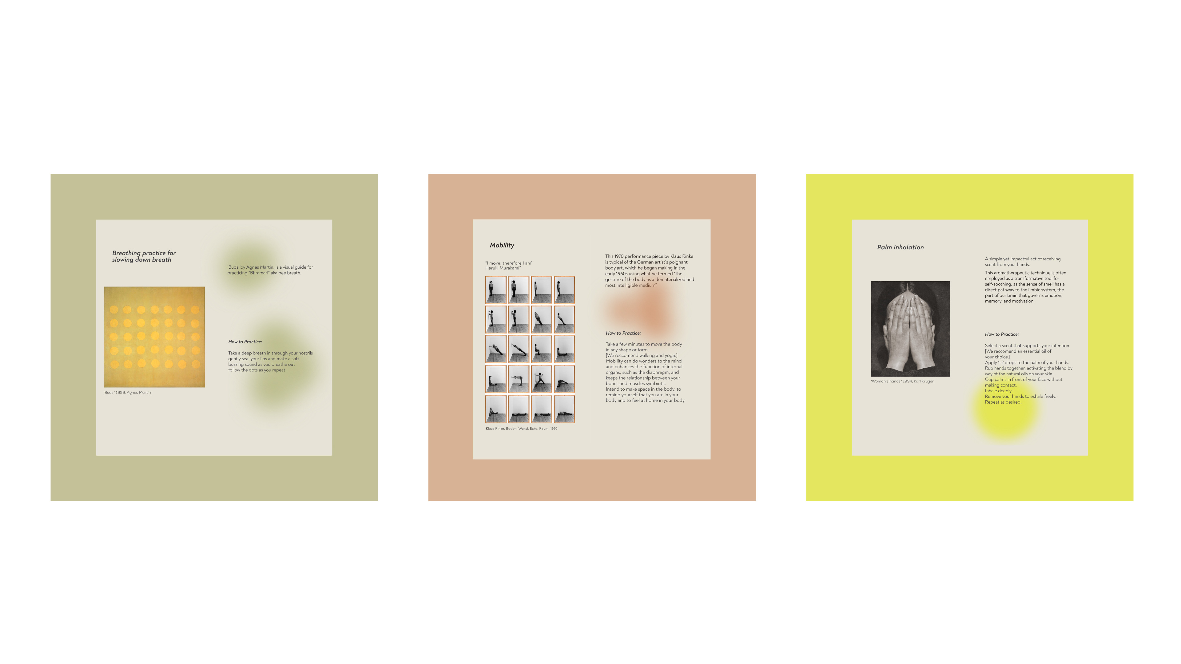 Mineral Muse: A post-humanist perspective on packaging design.
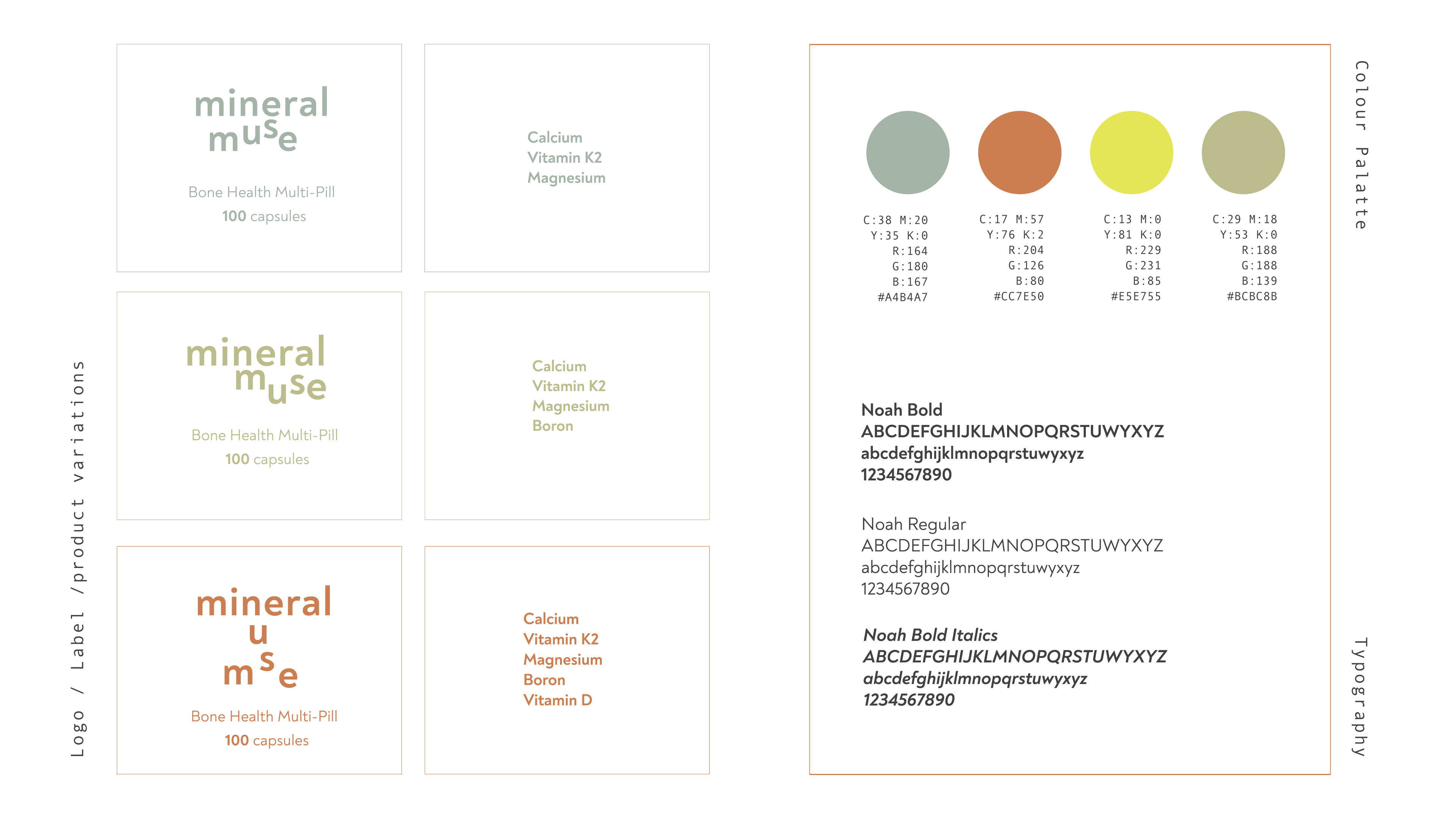 Mineral Muse: A post-humanist perspective on packaging design.
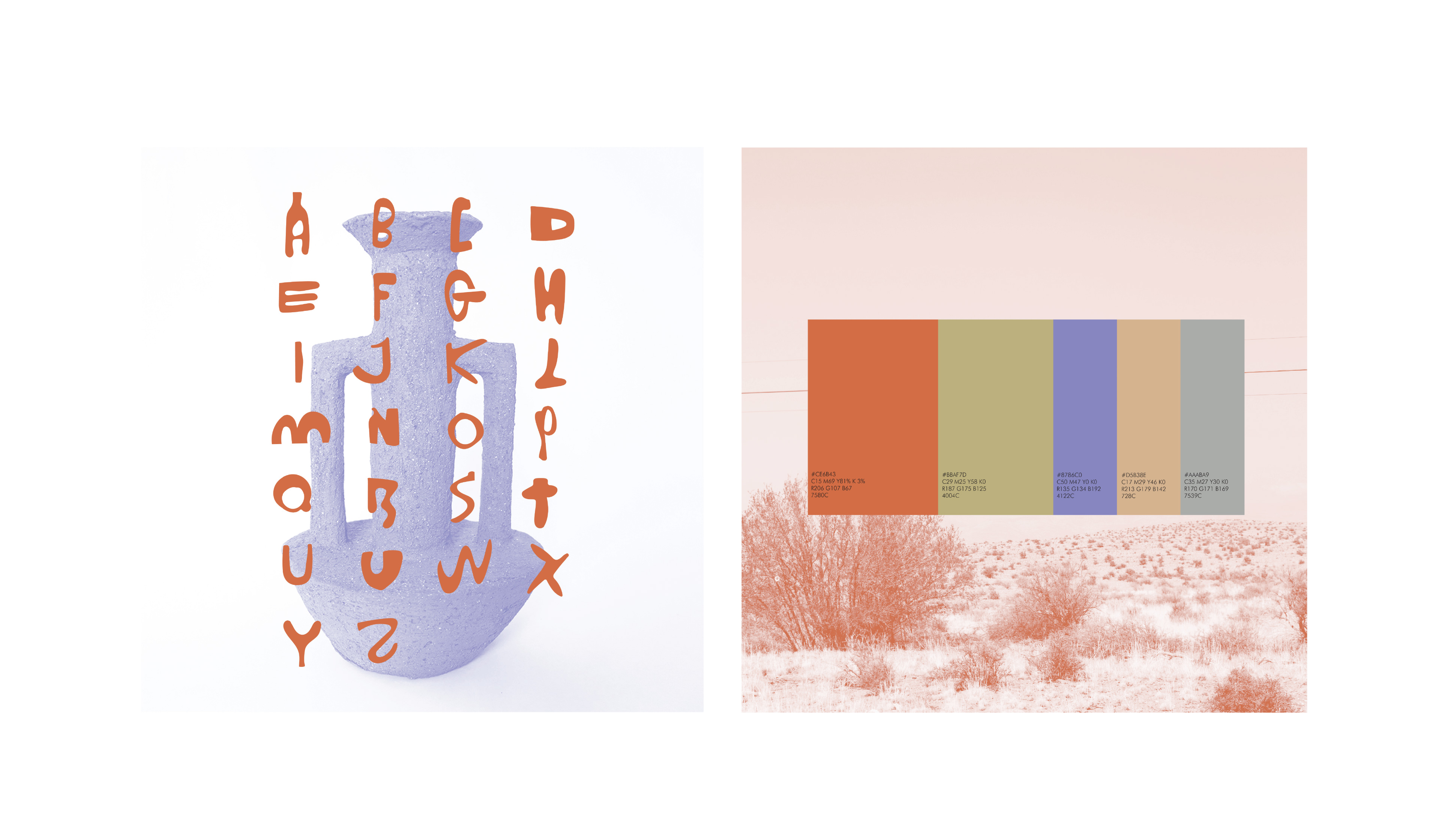
Clay Voete
Brand identity for a cultural event taking place in a local small town by delving into the local people, culture and art for inspiration.
My goal was to develop a visual identity for a retreat, (what I refer to as a hideout) in the small town of Despatch, Eastern Cape. Honouring the rich clay soil, which the town is situated on and paying homage to the simple joys of rural, country life. Hence a logo typeface based on wonky ceramic features and collateral emphasising the simple co-existence of the people in Despatch and the natural surroundings as well as celebrating the unique mixing of the English and Afrikaans language.
Copyright photographs all by Unsplash
 Clay Voete: Advanced corporate identity.
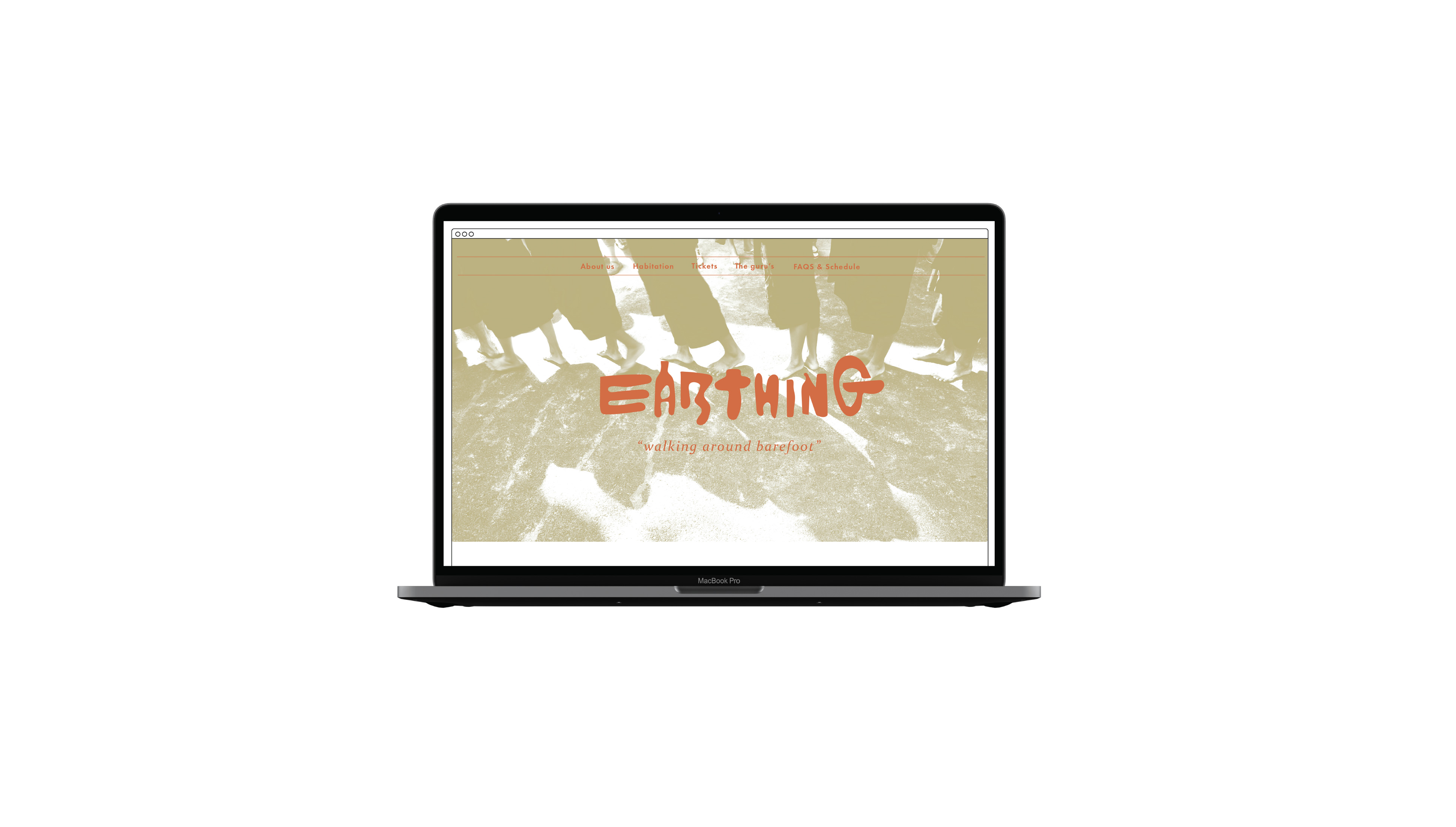 Clay Voete: Advanced corporate identity.
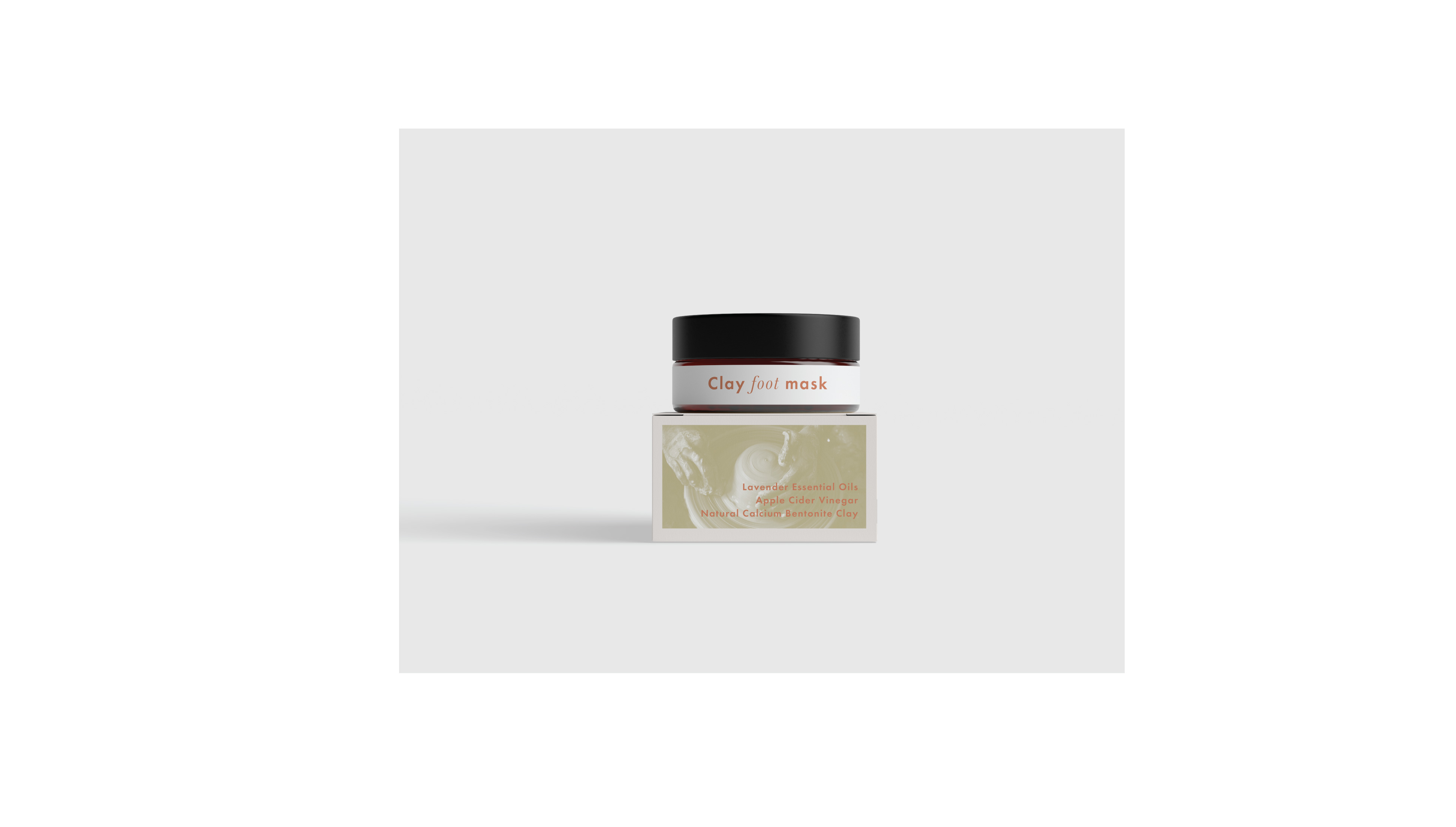 Clay Voete: Advanced corporate identity.
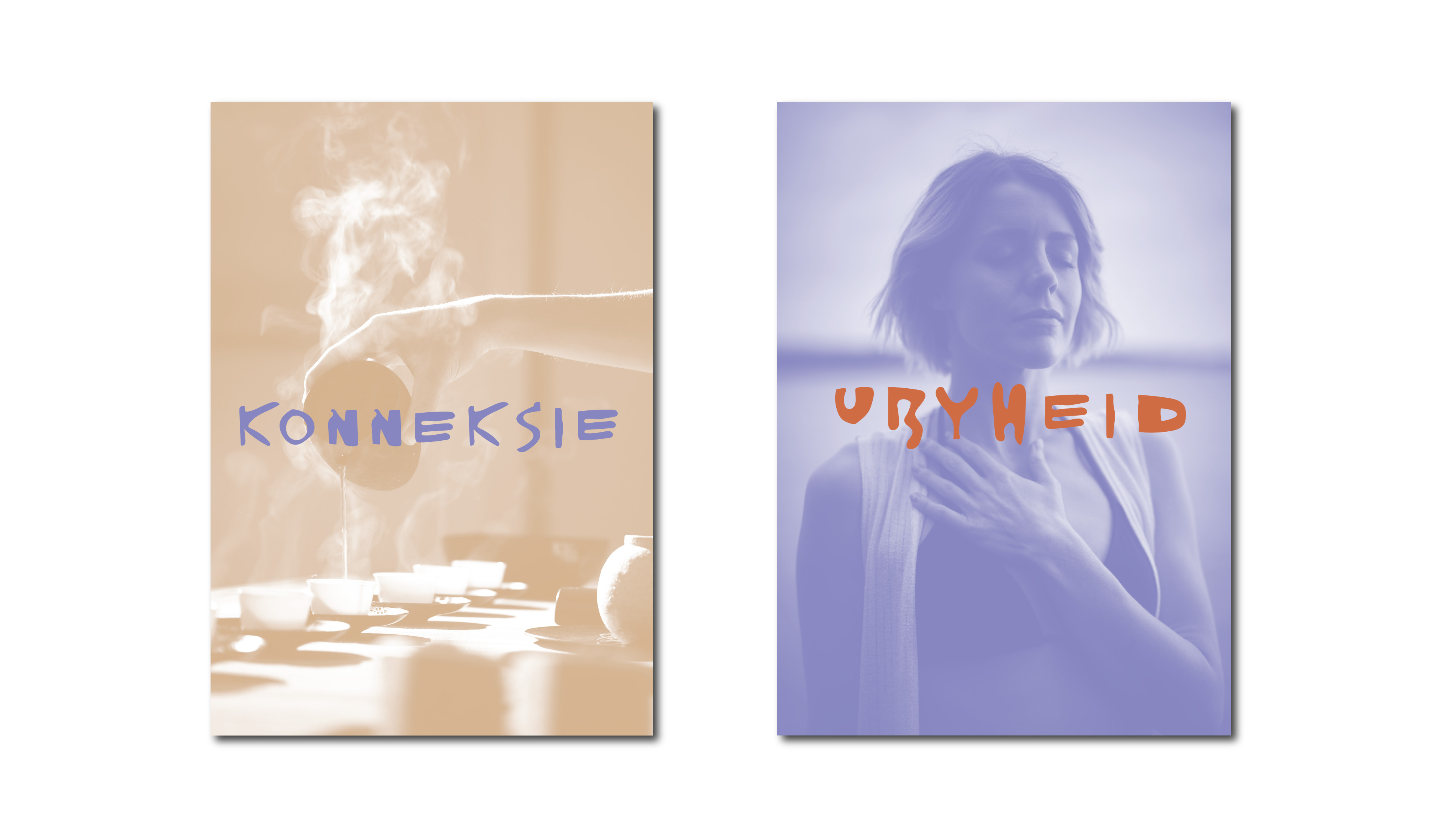 Clay Voete: Advanced corporate identity.
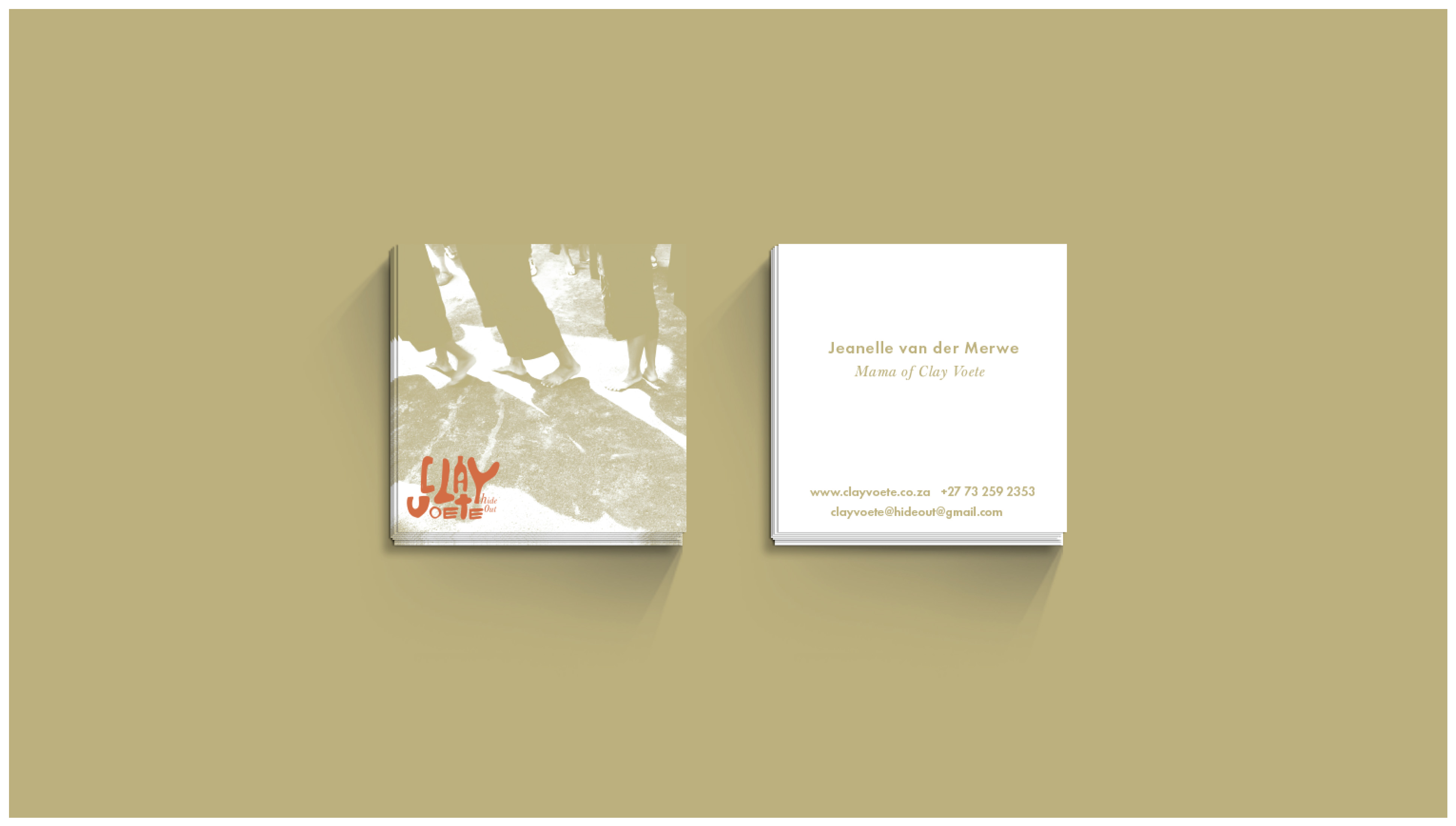 Clay Voete: Advanced corporate identity.